Product Experience Audit: The Board-Ready Alternative to a 60-Page UX Report
A product experience audit gives founders a board-ready diagnosis of revenue-linked friction, not a 60-page UX audit nobody reads.

Product Experience Audit: The Board-Ready Alternative to a 60-Page UX Report
The 60-page UX audit is the most common deliverable in B2B product consulting, and one of the least useful. It exists because agencies are paid to produce volume, not decisions. A product experience audit is the alternative: a short, evidence-led diagnosis tied to the metrics your board already reads. It tells you which parts of the user experience are leaking revenue, which fixes will return the largest dollar value soonest, and which "issues" the agency would have flagged are actually fine. If your team has ever paid for a deck-style UX audit and then quietly shelved it, the problem was not your team. It was the form of the deliverable.
The 60-page UX audit is a deliverable problem, not a content problem
The first thing to understand about the long-form UX audit is that the length is the product. Agencies bill against scope. Scope is easier to defend when the deliverable is heavy. So you get 60 pages of annotated screenshots, heuristic violations, persona maps, and a colour-coded severity matrix that no one on your leadership team will ever finish reading.
The content is often fine. The problem is the form. A founder running a $12M ARR business at 18% logo churn does not need 60 pages. They need three things: where revenue is leaking, which leak to plug first, and what it costs to plug it. A product experience audit is built around those three answers. The 60-page report is built around proving the agency did the work.
This is why the most useful piece of user research I have read in years is a Nielsen Norman Group note that quietly undermines the entire heuristic evaluation industry. A single evaluator, on average, finds only about 35 percent of the usability issues in an interface. Pause on that. The 60-page report your agency hands you, written largely by one or two senior reviewers running a heuristic evaluation against established usability principles, is by the field's own admission catching roughly a third of what is actually broken. The volume is real. The coverage is not.
A product experience audit accepts this constraint and works around it. Instead of trying to be exhaustive, it focuses on the few experience failures that map to a number on your P&L. Coverage of "everything wrong" is the wrong target. Coverage of "everything wrong that costs you money" is the right one.
A product experience audit is a diagnosis tied to revenue, not a usability inventory
Here is the working definition. A product experience audit is a systematic review of how customers move through your product, what blocks them at the moments where revenue is created or lost, and what the dollar value of fixing each block is. It is sequenced. It is short. It is written for the executive team, not the design team.
The difference between a product experience audit and a generic UX audit is the same as the difference between a P&L and a balance sheet of office supplies. Both are inventories. Only one tells you whether the business is making money.
A useful experience audit evaluates a product's revenue-bearing flows, not its surface polish. It evaluates the product's interaction patterns and user interactions at the moments where users either complete a goal or abandon tasks halfway through. For any digital product with paying customers, the output is decisions, not findings.
Three properties separate a real product experience audit from a UX deliverable with a different cover page:
It is anchored to revenue events. Activation, signup, trial-to-paid, expansion, renewal, reactivation, support deflection. Every finding traces back to one of those. If a finding cannot be traced to a revenue event, it goes in the appendix or it gets cut.
It is sequenced by impact, not by severity. "Critical heuristic violation" means nothing to a founder. "This onboarding step is responsible for an estimated 22% of trial-to-paid drop-offs, and a sequenced fix is roughly four sprints" is the language an executive can act on.
It is short enough to be read. The output is a board-ready document a CEO can read in 30 minutes and forward to investors. Not a deck the design team has to translate.

What a product experience audit actually contains
A useful product experience audit produces four artifacts, no more.
The first is a one-page executive summary. Three to five revenue-linked findings, a sentence each, with the estimated impact and the recommended fix window. This is the page that gets forwarded.
The second is the prioritized action map. A short, ranked list of fixes, each with a revenue link, a rough effort estimate, and a sequence position. The reader leaves knowing what to do in the next 30, 60, and 90 days. Call it a roadmap if that is the language your team uses; the label matters less than the sequencing.
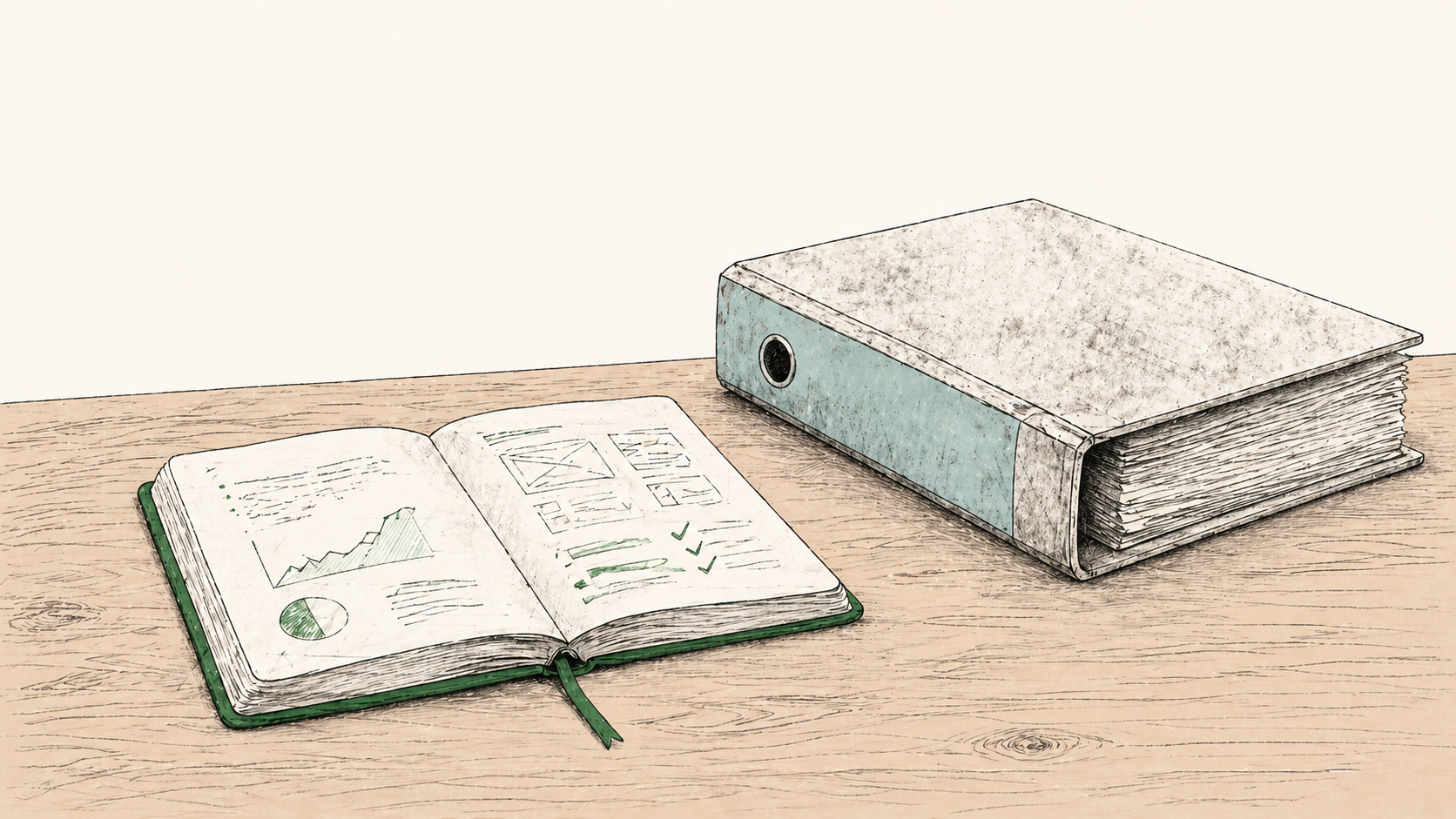
The third is the evidence pack. The actual quantitative data, behavioral data from session recordings, support tickets clustered by theme, funnel drop-offs measured against baseline, and quotes from user interviews that back up each finding. This is where the depth lives, but it lives in service of the summary, not as the headline. Both qualitative insights and quantitative insights belong here, side by side.
The fourth is a short remediation plan with a named first sprint. Not "improve onboarding." Specifically: "in sprint one, rebuild the goal-setting step, add inline error recovery to the connect-data step, and instrument the activation event so the next audit can measure improvement." A useful UX audit ensures the engineering team has tickets ready to pick up on Monday, not a Figma file with no implementation path. Product teams that have lived through the alternative know the difference: the audit either ends in shipped code, or it ends in a folder nobody opens again.
A product experience review without these four pieces is a UX audit dressed up in different language.
The agency UX audit fails because of who it was written for
The 60-page UX audit is a perfectly good document for the wrong audience. It is written for designers, by designers, judged by designers. The deliverable assumes the reader cares about consistency, hierarchy, accessibility compliance, navigation taxonomy, product design conventions, and Nielsen heuristics. Most readers do not.
A founder reading the report cares about: what is the cost of inaction, what is the cost of action, and which one is bigger. A VP Product cares about: what does this do to our roadmap, and which sprint absorbs the work. A board member cares about: is this a real risk, and is it priced into our forecast. A stakeholder in finance cares about whether the work aligns with business objectives the board already signed off on.
Almost nothing in the standard UX audit speaks to those readers. The reader scans the cover, reads the executive summary if there is one, and then asks the head of design "what should we actually do." At that point, the design lead translates the report into a list of product decisions. The translation is where the value is created. The 60 pages are the raw material.
A cx audit for a software product done well skips the raw material and ships the translation. The audit is the list of product decisions, with evidence attached. The benefits of a ux audit, when properly framed, are these decisions and the confidence to act on them; the page count is irrelevant.
There is a reason this matters now more than it did five years ago. McKinsey's Design Index, based on five years of data from 300 publicly listed companies, found that top-quartile design-performing companies grew revenues at roughly twice the rate of their industry counterparts. The argument that experience drives revenue is no longer contested. What is still being figured out is how to make experience legible to the people who hold the budget. The 60-page report does not do that. The product experience audit does.
The 60-page UX audit is a perfectly good document for the wrong audience. The product experience audit is the translation.

Should you do a product experience audit before a redesign?
Yes, almost always. The redesign-first instinct is the most expensive mistake I see at $5M to $30M ARR. A founder feels the product looks dated, hires an agency for a $50K to $200K visual redesign, ships it, and then discovers six months later that the activation problem is still there because nobody diagnosed the activation problem. They diagnosed the brand.
A product experience review run before a redesign does three things the redesign cannot do on its own. It tells you which problems are interface problems and which are deeper product strategy problems pretending to be interface problems. It uses analytics data, user interviews, and where appropriate light usability testing to identify which screens are actually responsible for the revenue you are losing. And it tells you whether the redesign should happen at all, or whether a far smaller intervention would capture most of the value.
Here is the conventional view. "We need to refresh the product. The brand looks old. Let's do a redesign and fix the UX while we are in there."
Here is why it is wrong. A redesign is a treatment. A product experience audit is a diagnosis. You would not let a contractor renovate a building before you knew which walls were load-bearing. You would not let a surgeon operate before the imaging came back. The redesign-first instinct is the equivalent of skipping the imaging because the patient looks tired.
The cheaper the audit, the less excuse there is to skip it. A focused product experience audit in the $3K to $15K range, scoped to four weeks, will tell you whether your $150K redesign is targeting the right problems. The economics of doing the audit first are obvious; the economics of skipping it require optimism that is not supported by the data.

The kind of finding that comes out of a real audit looks like this: trial users abandon tasks at the goal-setting step on day one, the form has 11 fields where it could have 4, support tickets clustered around "I can't figure out what to do next" have been growing for six months, and the activation event is not even being tracked correctly so nobody noticed. None of that requires a redesign. None of it sits on the design system or the wireframes. All of it costs revenue.
This is also why generic UX audit templates fail. They check accessibility, they check navigation patterns, they check that the design system is internally consistent, they identify usability issues against a fixed checklist, they highlight surface inconsistencies the design team already knew about, and they hand you a document that any reviewer with the same checklist would produce on the same product. None of it is anchored to your product, your users, your funnel, or the dollar value of any specific fix. The template is the giveaway: if the audit could have been written for any product, it was not really written for yours.
How a product experience audit prioritizes fixes by revenue impact
Prioritization by revenue impact is the part that separates a product experience audit from a UX deliverable. It is also the part most agencies do worst.
The standard agency move is to produce a severity rating. Critical, high, medium, low. The severity is judged by how badly the finding violates a usability heuristic. This produces a list that is internally consistent and externally useless, because heuristic severity does not map to dollars.
A revenue-impact prioritization works differently. Each finding is scored on three axes: how many users hit this friction (volume, taken from analytics), how much revenue depends on the user successfully completing the action (value at stake, taken from your pricing and conversion data), and how much engineering effort the fix requires (cost to remediate, estimated with the engineering team). Score is volume times value, divided by effort. The top of the list is the highest revenue return per engineering hour. The bottom of the list is what you ignore.
The reason this matters is that B2B product roadmaps are bottlenecked on engineering capacity. A founder running 12 engineers does not need a list of 80 findings. They need to know which three to do first.

The top-left quadrant is the only one you act on this quarter. The top-right gets sequenced for next quarter once you have proved the smaller fixes worked. The bottom row is for someone else, later, or never. This is how you actually prioritize improvements when capacity is the binding constraint.
A product experience audit that does not produce this matrix, or something close to it, is not doing the prioritization work. It is producing a finding inventory and asking you to do the prioritization yourself. The whole point of the audit is that this work is done by the time the document arrives.
The dollar-value piece is the part founders find most valuable, and it is also the part that most "audit" deliverables skip. Baymard Institute's data on ecommerce checkouts is the cleanest real-world example of how this kind of revenue-tied diagnosis works in practice; their analysis of large ecommerce sites found that addressing documented checkout usability issues could lift conversion rates by an average of 35.26%, with roughly $260 billion in recoverable revenue across US and EU markets. A product experience audit on a checkout flow that does not arrive at a comparable dollar number, scaled to your traffic and order value, has not done the work.
The same logic holds for B2B product friction. Bain's research, popularised by Frederick Reichheld, found that a 5% increase in customer retention can produce more than a 25% increase in profit in financial services, with similar dynamics across other sectors. If your audit identifies a retention-stage friction point and you cannot translate the fix into a percentage point of retained revenue, you are not done auditing.
What good looks like, and what to ask for
If you are evaluating a product experience audit (whether internal or from an outside advisor), the questions to ask are short. They will tell you within ten minutes whether the work will be useful.
Ask: what revenue events does the audit cover, and how were they chosen. The answer should name three to five revenue events specific to your business model. If the answer is generic ("the user journey"), the audit will be generic.
Ask: what is the deliverable, and how long is it. A 12-to-20 page document with a one-page executive summary is the right shape. A 60-page deck is the wrong shape. A Notion doc with 200 nested pages is also the wrong shape.
Ask: who will read this, and which decisions will it inform. The answer should name the founder, the VP Product, and (if relevant) the board. If the answer names the design team only, the audit is for the wrong audience.
Ask: how do you prioritize findings. The right answer involves volume, revenue impact, and engineering effort. The wrong answer is "severity" or "heuristic compliance." Best practices in this space have moved past severity matrices; if your auditor is still producing them, they are five years behind.
Ask: how is the evidence collected, and from whom. A real user experience audit triangulates analytics, user interviews, support tickets, and where appropriate light usability testing. Quantitative data tells you where the problem is; qualitative insights tell you why. An audit that uses only one of those is half an audit. The user interviews are also where you surface the mental models your customers actually hold and the personal preferences that shape how they navigate your product, neither of which shows up in clickstream data alone.
Ask: what does the first 30 days of remediation look like. A useful audit ends with a named first sprint, with specific tickets that an engineering manager could put in Jira on Monday. If the auditor cannot describe the first sprint in concrete terms, they have not finished the audit.
Ask: how do we measure whether the fixes worked. A good audit instruments the metrics it claims to move. If activation is the lever, the activation event is defined and tracked before remediation begins. Onboarding completion, signup-to-active, trial-to-paid, all of those need a baseline measurement before sprint one ships. Without that, the next conversation in six months will be "we shipped the fixes and we don't know if it helped."

This is what a board-ready product experience audit looks like, in practice. Mileage may vary by company size and product complexity, but the properties above hold across the $2M to $50M ARR range I work in. Below $2M, the audit is usually overkill; the founder still has direct user contact and can run a sharper version of this themselves. Above $50M, the audit needs to plug into a more formal product operations function, with more user research running in parallel, but the principles are unchanged.
The Forrester research that gets cited most often in this space, that every dollar invested in UX returns up to $100, is the upper-bound figure, not the typical outcome. I would not anchor a board conversation on it. The figure that travels better is the McKinsey one: a top-quartile design performer outpaces its industry counterparts on revenue growth by roughly 32 percentage points over five years. That is the order of magnitude you are working with when product experience is treated as an executive concern rather than a styling problem. A product experience audit is the entry point. It tells you where you are starting from and what fixes will close the gap.
What the best auditors do, that the worst do not, is uncover insights into user behavior that the product team had access to all along but never assembled. The data was sitting in Mixpanel. The complaints were sitting in Zendesk. The qualitative signal was sitting in user interviews nobody had time to synthesise. The audit's job is to assemble those signals against the product's interaction model, weigh them against the user needs the product is supposed to serve, and translate the result into product decisions. Done well, it lets the product team better empathize with users on the specific moments that matter, instead of treating empathy as an abstract value. The clearest example is the onboarding process: by the time you finish the audit, the team should know exactly which step in onboarding loses the most revenue and what changes to that step.
The other thing the best audits do is set clear objectives for what the next 90 days are supposed to prove. Not "improve usability." Specifically: "lift trial-to-paid conversion from 24% to a target of 32% by addressing onboarding-stage drop-off, validated by a controlled rollout against a held-out cohort." Clear objectives let you proactively measure whether the work paid back, instead of debating it later. The auditor's job is to make the goalposts visible before the work starts, so user expectations and team expectations align.
Stop buying long-form UX reports. They are an artifact of how agencies bill, not how founders decide. The deliverable you actually want is shorter, sharper, and tied to numbers your board already tracks. A product experience audit, done well, gives you three things the 60-page report cannot: a defensible diagnosis of where revenue is leaking, a sequenced plan of which fixes to ship first, and a measurement plan that tells you whether the fixes worked.
If your team is sitting on a UX audit it has not implemented, the report is not the problem. The form was always wrong. Diagnose the experience the way you would diagnose any other revenue lever: short, evidence-led, sequenced, owned at the executive level. Ship the first sprint. Measure the lift. Streamline the next iteration. Treat the audit not as a one-time event but as the input to a product strategy conversation that should happen every quarter.
The redesign instinct is the most expensive substitute for this work. Audit first. Redesign only if the audit tells you to. And if the audit tells you that the real problem is not visual at all (which it usually does), you have just saved the cost of a redesign and bought yourself a roadmap that ships value instead of polish. That is what a useful user experience audit looks like, and that is the only kind worth paying for.