Myer
Loyalty integration, combined sign-up, and member pricing: three flagship initiatives, each shipped, A/B-tested, and directly attributed to revenue. Not just designed. Measured.
Role: Sr. Product Designer
$30m+
revenue uplift across flagship initiatives
$40m
Pay with Points integration
$27m
Combined Signup gross revenue
$5m+
MYER one Exclusive Pricing quarterly
120+
design iterations
30+
Myer initiatives led
Bringing two of Australia's most iconic brands together.
I was brought in to lead the digital customer experience across Myer.com.au and the MYER one loyalty program: two of Australia's most recognisable retail brands, running on two disconnected platforms, with a customer base that had no idea they were separate.
My work spanned five operational pillars:
Insights sourcing and blueprinting.
Translating support tickets, NPS verbatim, and funnel data into a prioritised backlog the exec team could rally around.
Redesigning the front end software.
Unpicking legacy flows to make the core purchasing journey faster and more trustworthy.
Integrating the promotional team’s software.
An in-house tool that saved roughly $200k a year in licensing while giving the merchandising team real-time control.
Enhanced customer delivery experience.
Introduced Express Delivery and clarified post-purchase comms to lift satisfaction during COVID-era volume spikes.
Expanded payment options.
Card on File, PayPal, and faster checkout to reduce abandonment on the steps where we were leaking the most revenue.
Immersive shopping.
Spearheaded Virtual Try On Makeup (AR), giving customers a new way to engage with product in session.
The two case studies below, Combined Signup and MYER one Exclusive Pricing, were the flagship bets. They were also the hardest. Both required coordinating design, engineering, loyalty, and legal across two platforms that couldn't be replatformed, during a period where the business had no margin for a failed release, which meant every decision had to be evidenced, every sign-off earned.
Combined signup
The problem
MYER one (M1) was one of the most recognised loyalty brands in the country, but the experience customers actually had sat behind it was fractured. Myer.com.au and MYER one ran on different platforms (WCS and Salesforce), with different logins, different data models, and no shared identity layer.
Customers didn't know or care. They'd try to log into Myer with their MYER one credentials, fail, get pushed into a registration flow they didn't want, and bounce. NPS and VoC surveys were full of it. Transactional data to quantify the impact didn't exist, because the accounts themselves were split.
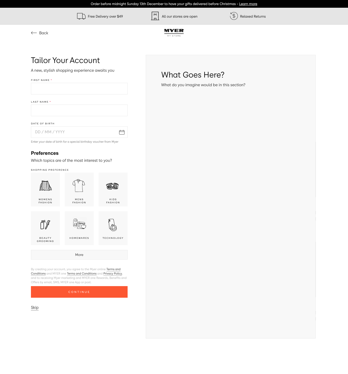
The objective: design a single registration journey that served both brands, without replatforming either. Unify where we could, orchestrate where we couldn't, and give customers one experience regardless of which brand they thought they were dealing with.
Customer challenges
Unable to log in with MYER one credentials. A large share of our most loyal customers hit a dead end at the login screen.
Forced registration paths. Users attempting to log in with M1 details were pushed into creating a new Myer account, duplicating their data and their frustration.
No reliable data on who was affected. The data fragmentation that caused the problem also made it invisible to reporting. NPS verbatim was our strongest signal.
Approach
Prioritised high-impact conversion elements first. The registration and login surfaces were doing more revenue damage than anything else, so they moved ahead of lower-leverage work.
Resolved branding early. Knowing brand sign-off would take longer than design, we front-loaded colour, component, and naming decisions so engineering wasn’t blocked later.
Designed within platform constraints. Full consolidation of WCS and Salesforce wasn’t on the table, nor should it have been. The goal was a cohesive front-end experience over a unified back end, with a clear path to deepen integration over time.
Customer benefits
One registration form instead of two. No duplicate data entry, no managing parallel accounts.
No more forced sign-up paths. The login flow finally behaved the way customers expected it to.
MYER one linked from day one. Benefits surfaced at the point of registration, not hidden on a separate site.
Single source of truth for customer data. One profile, one preference set, one view of the customer across both brands.
Business benefits
Higher M1 registrations and loyalty tag rate. A simpler form converted more sign-ups and more tagged transactions, which fed directly into retention modelling.
An incremental path to single sign-on. This release set the groundwork without requiring the full SSO investment up front.
Database convergence between WCS and Salesforce. A meaningful first step toward the unified customer profile the business needed for personalisation.
Higher data quality. Fewer duplicates, cleaner segmentation, better decisions downstream.
I scoped the work around a set of standing questions: what does NPS verbatim actually say about this problem, where are the form-field dropouts in GA, what research already exists in the repo, what are the back-end constraints we're designing against, and how do we keep requirements legible as they change. These framed every workshop, every spec, and every hand-off.
Minimum viable product
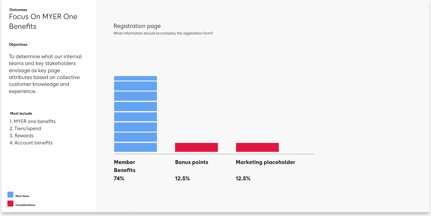
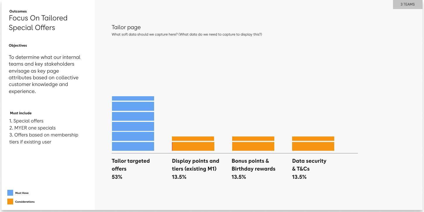
Stakeholder workshops: informing product development
To inform concept development, I ran a competitive analysis of leading Australian eCommerce retailers and pulled UX benchmarks from the Baymard Institute to anchor the design direction in evidence, not opinion.
Core Myer product teams and the MYER one team joined a series of workshops to surface goals, constraints, and the quiet disagreements that usually only come out late in delivery. The workshops did two things at once: they generated ideas, and they built the stakeholder buy-in the project would need to survive a long delivery cycle.
The workshop output wasn't just direction for the design. It was the internal alignment document we returned to every time someone tried to add a field.
Key findings
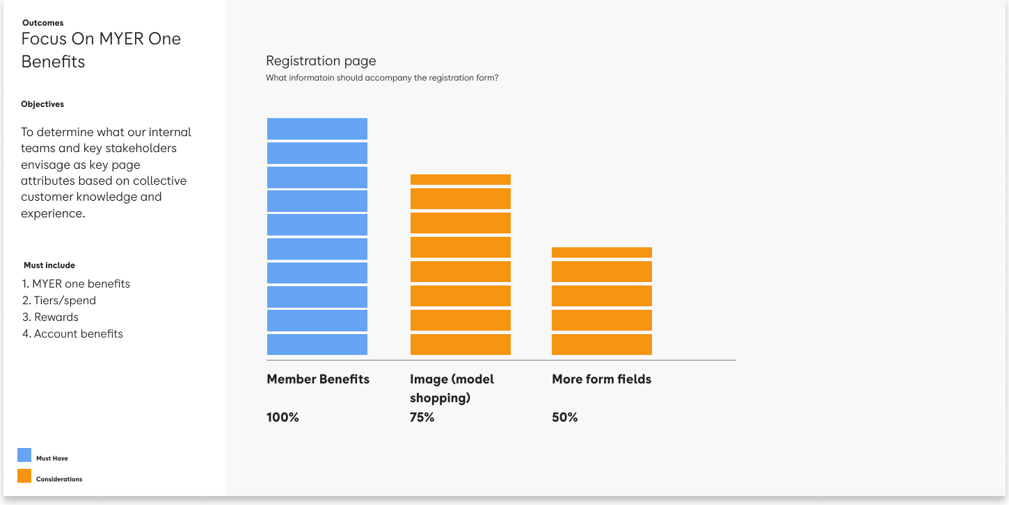
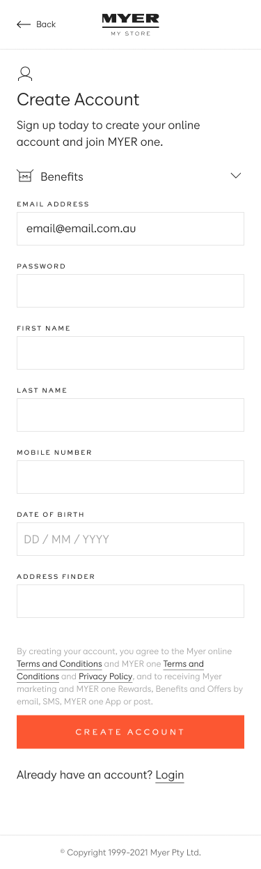
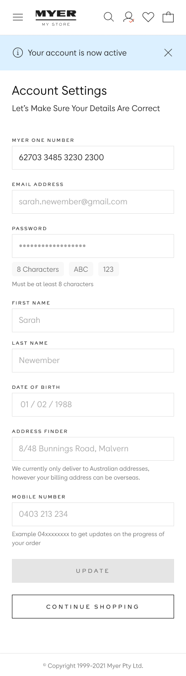
Simplify the initial registration. Email and password only as step one. Everything else belongs later in the journey, not here.
Progressive profiling. Capture additional customer data at moments when it’s useful to the customer, not at the moment we happen to want it.
Wireframes were used as part of the workshops to engage a broad audience of stakeholders.
Internal test results
Using drop-out rates on form fields as the starting signal, I ran extensive user testing against competitor registration flows. The results were unambiguous: everything non-essential on the registration page was hurting conversion.
I stripped the page back to email and password, paired with a strong value proposition and a single clear call to action. Every other field moved to a progressive profiling modal that customers could complete at their own pace, or skip entirely, with later opportunities to fill in at account settings or during checkout.
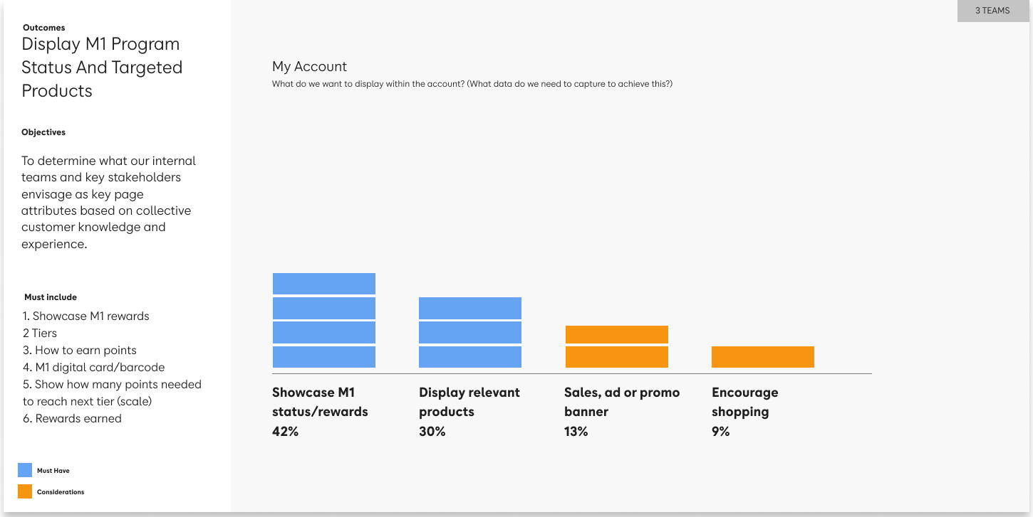
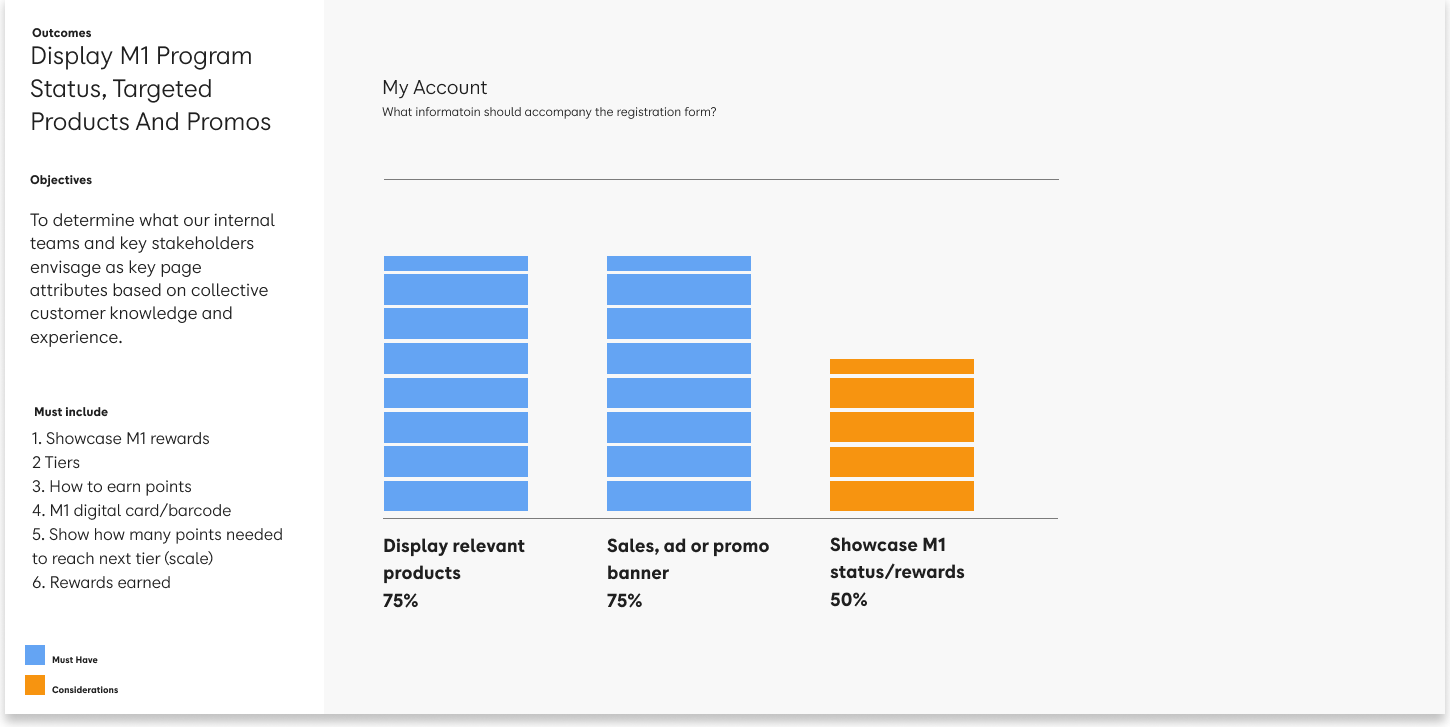
Stakeholder workshop results (n=40+)
74%
expected member benefits prominent on the registration page
53%
expected personalised offers based on their preferences
42%
expected MYER one status and rewards on My Account
These findings validated the direction and sharpened the next round of testing. The pattern held: when we optimised the experience around what customers actually expected, stakeholder alignment followed rather than led.
Prototyping
With budget secured, I moved to concept testing through Askable and UserTesting. The structure was deliberate: novice users first (new to Myer, new to MYER one), then veteran users (existing customers on both), with the primary user group weighted toward the female 25 to 34 segment that drove the majority of revenue. Between rounds, I refined the concepts, reported back in PowerPoint for circulation, and kept key stakeholders in the loop so nothing landed as a surprise at sign-off.
User test results
Two rounds of testing and reporting, presented back to both the MYER one and Myer teams. Minor variations were deliberately carried through into the final recommendations to give stakeholders a productive choice, funnelling debate into an A/B testing roadmap rather than sign-off gridlock.
I continued socialising updates with decision makers between rounds. By the time the final concept reached approval, the people who needed to say yes had already been part of the conversation for months.
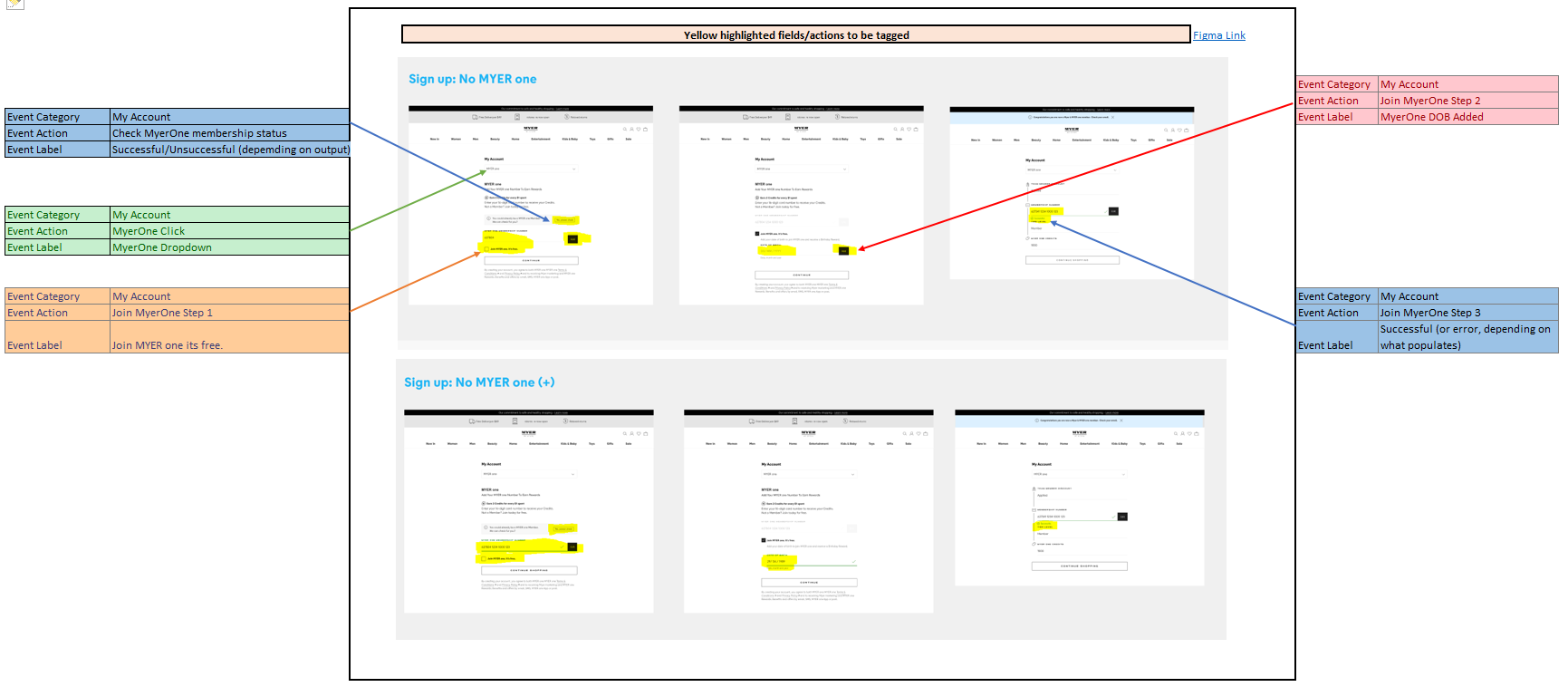
Tag Manager & Confluence
I wrote the functional documentation, user cases and acceptance criteria, in Confluence, giving engineering and the broader delivery team one canonical source rather than a scatter of Slack threads.
Working with front-end and back-end engineers, I reviewed Storybook for component compatibility, updated Jira sprint cards to reflect both GTM tagging and functional requirements, and stayed close to the team through delivery. The design system got the updates it needed along the way.
The highest converting variant across every split test since launch.
The first release shipped March 2022. As of October 2022, my design remains the highest converting variant across all split tests run since launch.
Revenue outcomes
$27m+
gross revenue uplift from joint account creation
#1
highest converting variant across all A/B tests since launch
MYER one Exclusive Pricing
With combined signup in place, new opportunities were possible
Unifying registration and login created something the business had been missing for years: a merged view of the customer at the moment of intent. That opened the door to bringing more of MYER one's value directly onto Myer.com.au, specifically exclusive pricing on selected products to drive retention and AOV.
Before this, registering for MYER one meant leaving the site. Most customers didn't know Myer and MYER one were separate brands until they tried to reset a password and hit a wall. A meaningful share of the customer base had an M1 account but no Myer account, which broke login, interrupted checkout, and drove cart abandonment into the ground.
With that fixed on the front end, pricing was the next leverage point.
Customer challenges
No visibility of member pricing on Myer.com.au. Exclusive member benefits existed but weren't surfaced at the point of purchase, invisible to the customer, and leaving retention value on the table.
Account fragmentation blocked access to benefits. Customers with only an M1 account couldn't access Myer pricing without re-registering. The friction stopped them before the benefit landed.
Members didn't know what they were missing. MYER one's value proposition was buried in emails and the M1 site, not present in the product discovery and checkout moments where it could drive action.
Approach
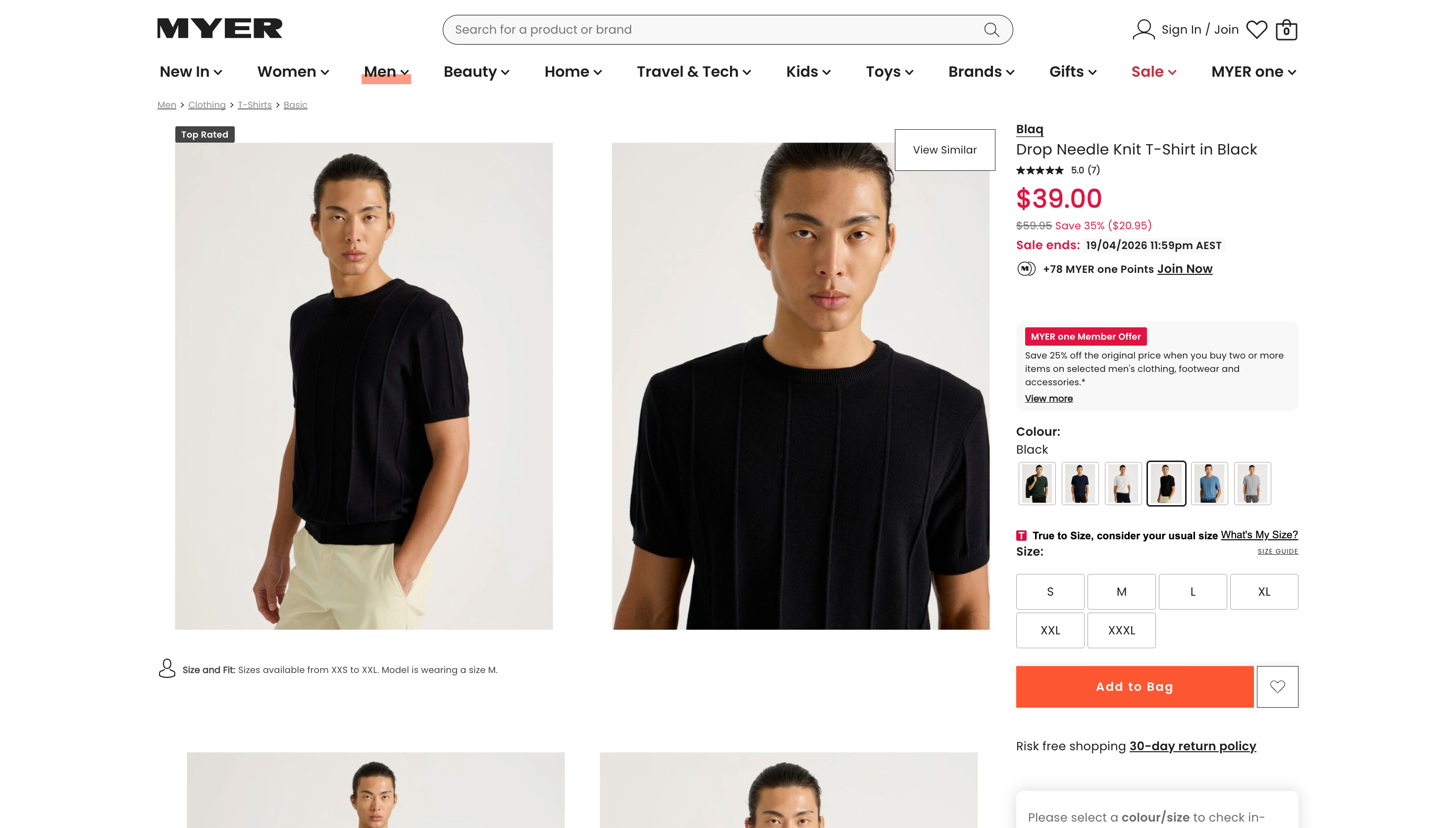
Surface pricing at the point of intent. Design Exclusive Pricing into the product tile and product page, the two surfaces with the highest revenue leverage, not buried in account settings.
Design for six membership scenarios. EPS1 to EPS6 covered every permutation of Myer and MYER one account status. Each required a distinct flow, with no dead ends.
Validated before back-end was ready. The MVP was designed and tested against the existing registration constraints. Future-state designs were handed off separately for the next release cycle.
Customer benefits
Member pricing visible on product tiles and pages, no hunting, no account switching.
Exclusive offers surfaced at the moment of purchase intent, not after the fact.
Clear upgrade prompts for non-members at the exact point the value proposition lands.
Business benefits
Direct revenue uplift from member-exclusive pricing driving conversion and AOV.
Stronger M1 enrolment at the point of purchase, the highest-intent moment in the funnel.
A scalable pricing surface that could extend to additional categories and campaigns.
The standing questions were the same as Project 1: where does the data show friction, what are the back-end constraints, what does research say, and how do we keep the requirements stable under stakeholder pressure. The answers were different, but the discipline was identical.
UX benchmarking
The starting point was Baymard's UX benchmarking combined with competitive analysis of the local retail market. Baymard's assessment covers 63 major eCommerce sites and 245 product pages globally, yielding clear signals on product page attributes that adhere to or violate conversion best practice.
These findings informed the design of the two highest-leverage surfaces: Product Tiles and Product Pages. When the evidence is that clear, you don't redesign. You align.
Entry-point mapping
In parallel, I audited both MYER one and Myer to map every entry point between the two properties, a surprisingly large and tangled set of links, redirects, and legacy pages accumulated over years.
The map became the case for what to redesign, what to repurpose, and what to decommission. I walked key stakeholders through it so the cuts were shared decisions rather than designer preferences.
User flows
I built a primary user flow for internal communication, supported by sub-flows showing how Exclusive Pricing would behave across the different permutations of Myer and MYER one membership status. Engineering needed these to size the back-end work. Stakeholders needed them to understand what was and wasn't in scope.
Product tile testing
Two testing streams ran in parallel:
Online task testing to determine colour associations with Sale, RRP, and MYER one pricing, and customer preference across the existing Myer and M1 brand palettes.
Moderated user tests across two rounds (4 to 5 participants per cohort). One concept won both rounds, scoring highest on clarity, preference, and attention.
I arranged participants, testing briefs, consent forms, scheduling, and reporting end to end.
Product page testing
Two variations tied as winners across both cohorts. One was classed as MVP, ready to deploy with minimal engineering risk. The other was the clear winner on experience uplift but required back-end and business rule changes scheduled for future quarters. Both moved forward: MVP now, experience winner on the roadmap.
Key challenges: 6 scenarios
Six scenarios defined the problem space:
Existing Myer, existing MYER one, accounts linked. Login as normal, price applied at checkout.
Existing Myer, existing MYER one, accounts not linked. Login as normal, M1 applied at checkout.
Existing Myer, new to MYER one. Login as normal, but no easy way to register for M1 without leaving the site.
New to Myer, new to MYER one. Register through combined signup, price applied at checkout.
New to Myer, existing MYER one. Attempting to log into Myer with M1 credentials (the NPS failure mode).
Guest checkout. Apply existing M1 at checkout, no ability to register in flow.
The hardest scenarios were the ones that pulled customers off the purchase path mid-journey (EPS2, EPS3, EPS5). To keep them in flow, I designed a MYER one intercept modal post-login and repurposed the existing MYER one side drawer, so customers could register or link their account without leaving the screen they were shopping on.
UI Design
With the journey signed off, I moved to UI. End-to-end screens for each of the six scenarios (EPS1 to EPS6), fully documented in Confluence and Figma with naming conventions that the engineering team could actually navigate.
Milestones
Colour. The new MYER one Green was signed off based on task testing results. Customers preferred it, and it met WCAG AA on white.
Layout. Product Tile and Product Page designs signed off based on testing winners, with future A/B variants mapped.
Journey. MVP released against the existing registration flow. Further journey optimisation was gated on back-end and business rule changes scheduled for later quarters.
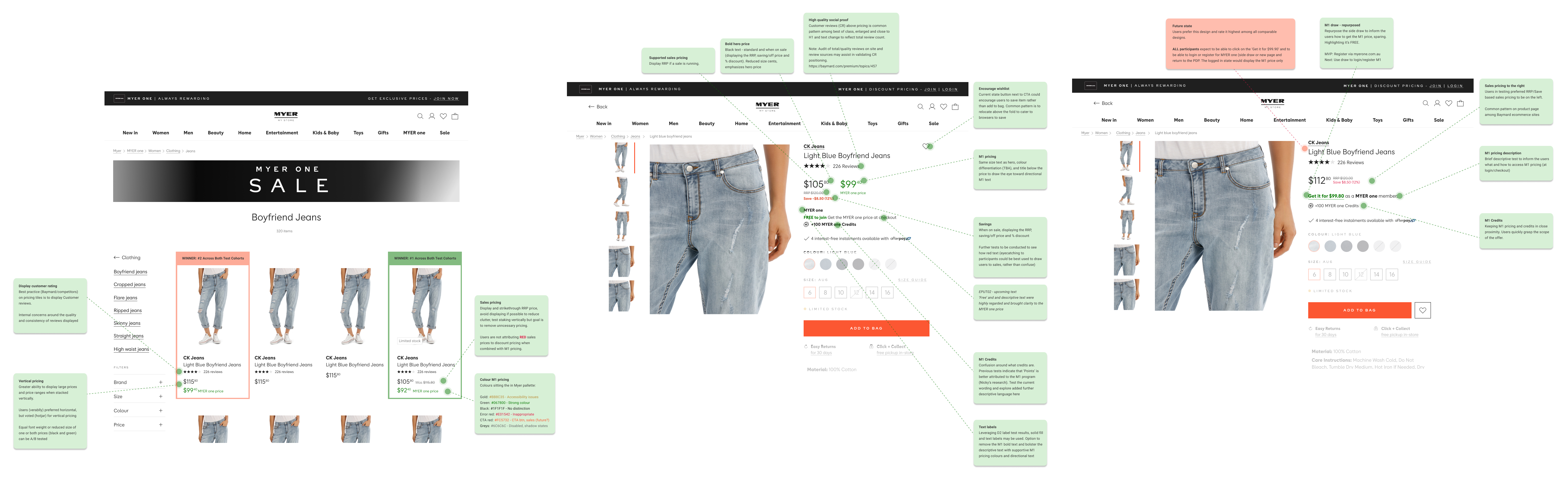
Winning initial release. Product Tiles (left), Product Page (centre). Future state, once back-end changes deployed (right).
$32m+ attributable uplift across both flagship initiatives.
MYER one Exclusive Pricing was paused in early 2021 while the business reshuffled priorities under COVID pressure. It resumed in November 2021 and went live in early 2022 against my validated designs.
The lever in both cases was the same: experience treated as a revenue question, not a design one.
Revenue outcomes
$5m+
Exclusive Pricing gross revenue uplift, first quarter
$32m+
attributable uplift across both flagship projects
This is the methodology I bring to your business. Without the enterprise headcount or three-month onboarding.
Anton is process-driven, research-focused, switched on and an absolute hoot to work with. An invaluable team member with the innate ability to simplify complex design problems, delivering effective and engaging user experiences. I know, right... an absolute unicorn!
Angela Edwards
Founder, Elli Cares, formerly at Myer
Building an eCommerce product?
Get a deep-dive experience audit designed specifically for DTC brands, retail, and marketplaces.