MethodLoop
Zero product, zero users, ten weeks.
Led research, strategy, and full product design for a 0→1 SaaS, from first interview to validated MVP across mobile, tablet, and desktop.
Role: Sr. UX Designer → Design Manager
300+
alpha users from Apple, Google, eBay, IBM, Amazon, Lloyds Bank
36
user interviews
42
usability tests
240+
screens shipped
100%
on budget
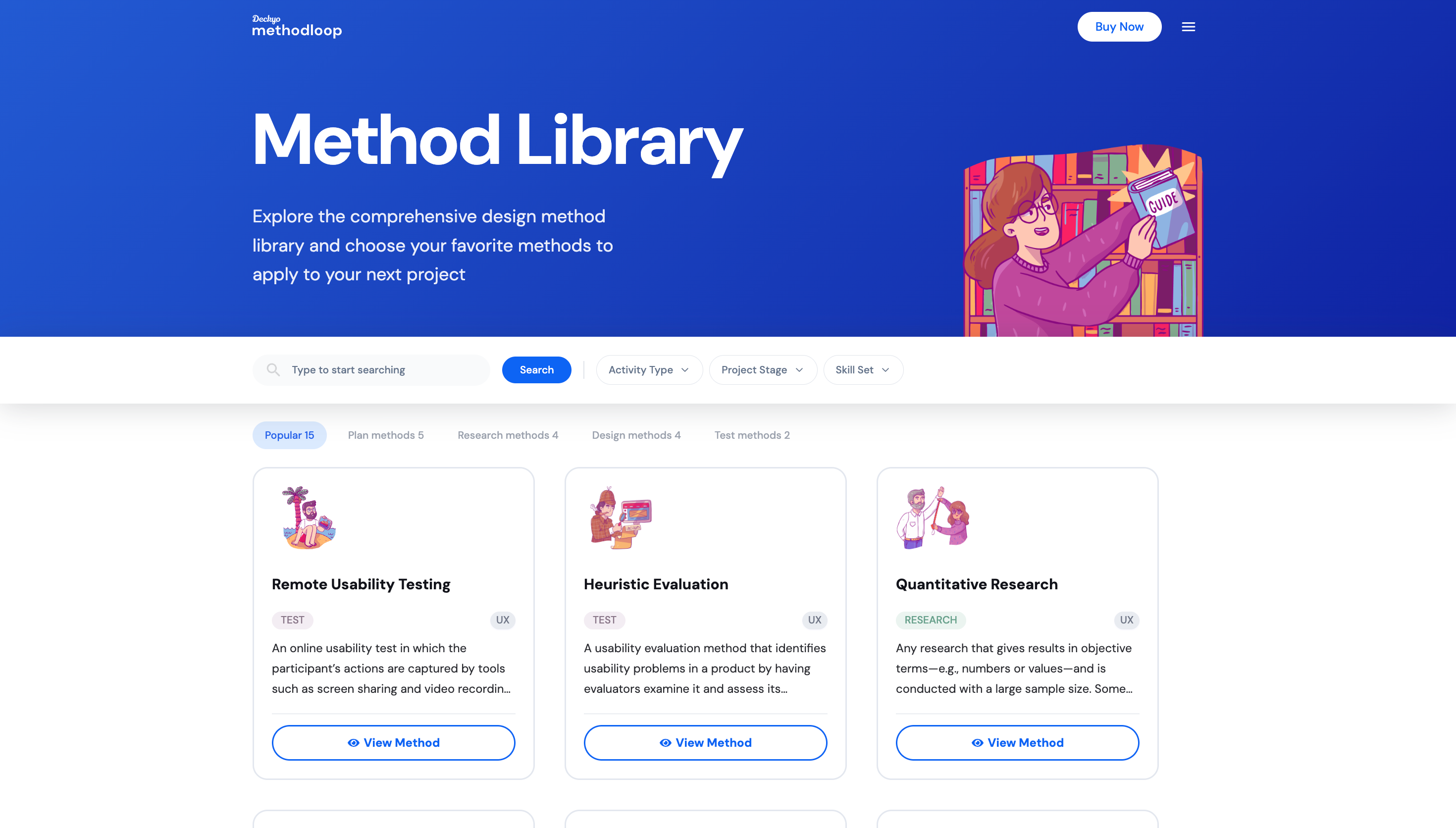
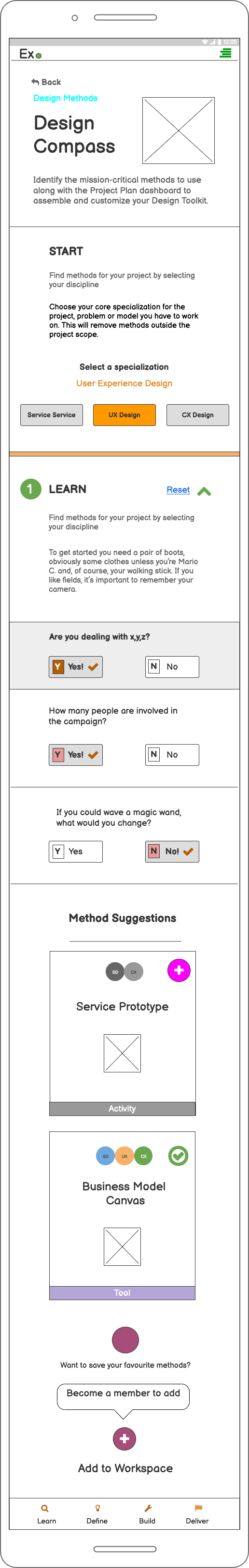
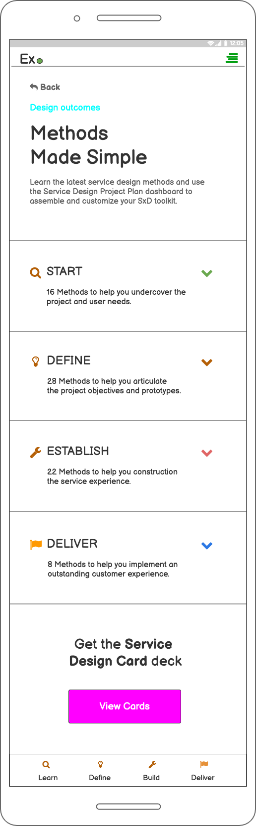
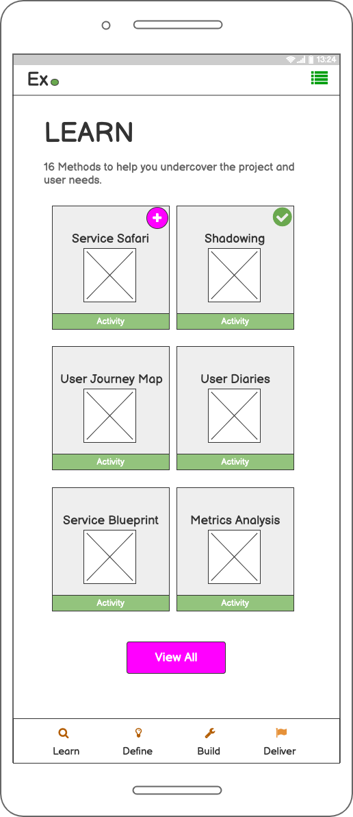
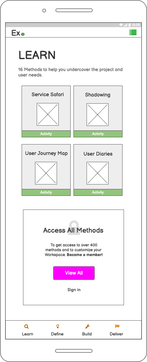
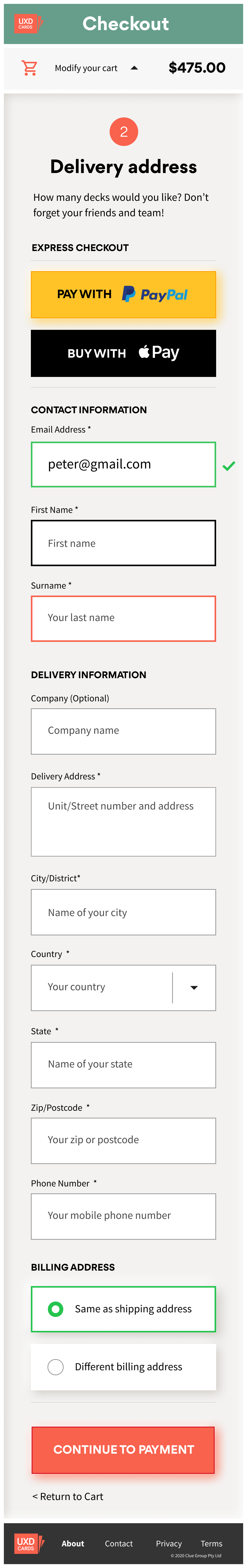
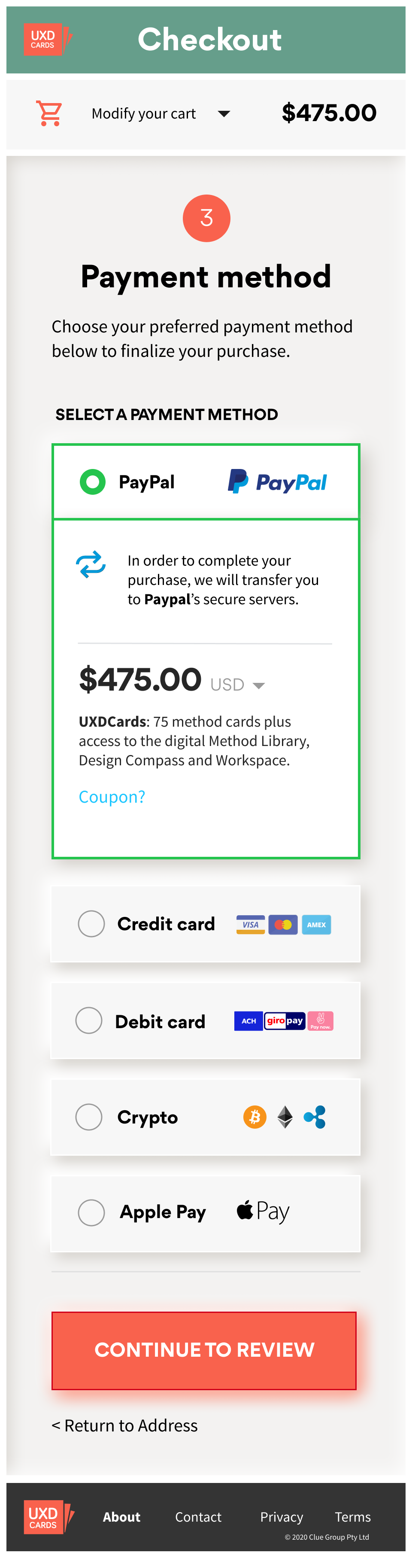
What is MethodLoop?
A library of design activities combined with workflow management, helping designers quickly identify, organise, share, and track their creative tasks and team's overall workflow.
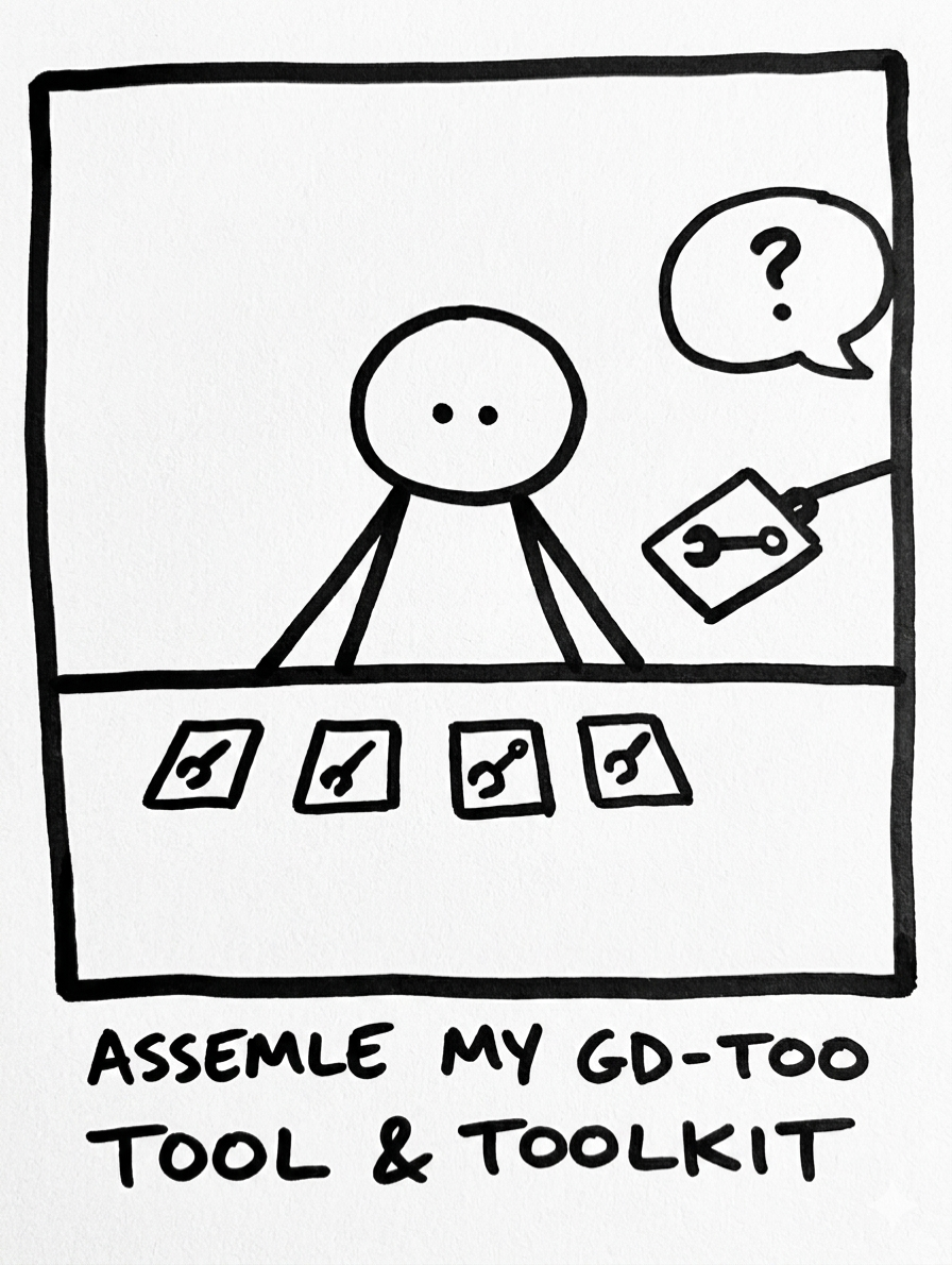
How is it unique? Think Trello, but with all the design tasks expertly pre-defined. Unlike other project management software, all design-related tasks are assembled in pre-defined checklists; designers need only select and add methods to their workflow to start a project. The library contains over 250 professionally written, co-contributed methods.
Project goal
Identify and build user requirements into a validated MVP: research, prototype, test, and deliver responsive mobile, tablet and desktop UI from inception to hand-over.
Roles & responsibilities
Research. End-to-end user research: contextual interviews, storyboards, persona development, and JTBD frameworks.
Design. Interactive prototyping across lo-fi to hi-fi stages. Component library built in Figma, Sketch and Adobe Illustrator.
Testing. Concept-stage user testing and mid-to-hi fidelity usability testing with SEQ intercept surveys.
Delivery. All visual assets, functional specs, and handover documentation co-created with engineering.
Leadership. Assembled and managed the design, production, and content teams across a remote international collaboration.
Brief
Understand how designers approach active learning, the challenges experienced, and how they find cadence in their work. Prototype to improve retention and referral metrics.
Duration
Approximately 10 weeks, inception to hand-over.
Outcome
Research, validate, design, test and deliver MVP desktop, tablet, and mobile responsive views. Early adopters include designers from Apple, Google, eBay, IBM, Amazon, and Lloyds Bank.
Empathy building
The first task is always to understand context, suspend assumptions, and gather user requirements. To better understand learning journeys, we undertook:
Contextual interviews: 1:1 interviews with design practitioners over three weeks in a “Research Sprint.”
Storyboards: Mapping the journey, touch-points, and key moments of friction and opportunity. Reframing themes into use cases using the Jobs-to-be-done framework, producing ‘minimise’ and ‘increase’ customer statements as an overlay.
Personas: Using our research and JTBD customer statements to form personas around primary pain-points and prioritised themes for each segment.
A high-level user flow based on criteria from interviews and JTBD survey.
Storyboard: the designer's learning journey
Sixteen designers interviewed: Junior (0–2 years), Mid (2–5 years), Senior (5+ years), and Design Managers.
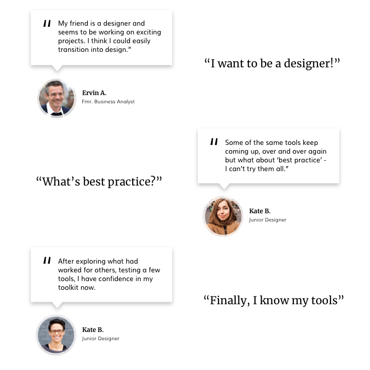
Key takeaways
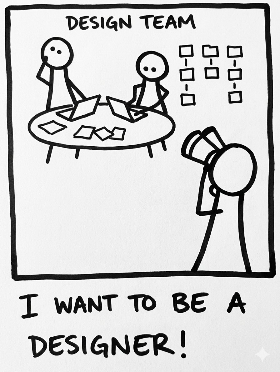
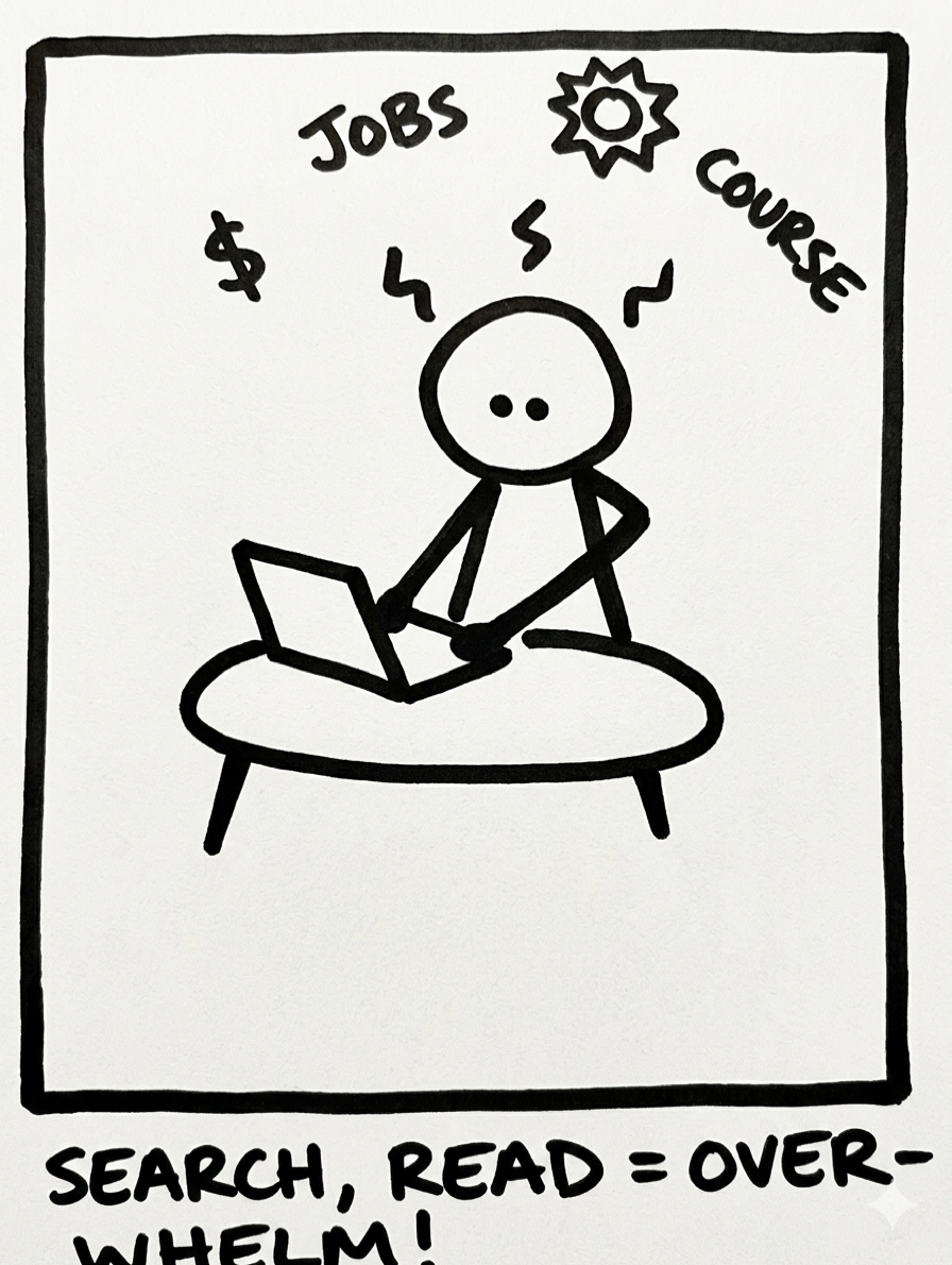
Junior designers struggle to identify which problems to work on. They apply text-book processes with limited adaptability, remaining highly dependent on observation and specific direction from senior designers.
Applying the wrong methods leads to poor problem-solution fit. Without a structured toolkit, juniors lack confidence in method selection, leading to wasted effort and delayed insights.
Senior challenges operate at a different altitude. Seniors are focused on stakeholder management and business acumen, not process discovery. This made finding mid-weight participants particularly difficult; we opted for juniors and seniors only.
Key insights: differing mental models
The research surfaced a clear divide in how designers at different stages experience their work, the same problems seen through fundamentally different lenses.
- Consumers, not distributors
- Poor capture & synthesis
- Limited method selection ability
- Delayed decision-making
- Anxiety around adaptive processes
- Quick to adopt, quick to drop tools
- Emerging confidence
- Building personal toolkit
- Seeking best practice clarity
- Bridging junior → senior gap
- Hard to identify in research
- Mixed self-assessment
- Information distributors
- Adaptive stakeholder focus
- Strong method selection
- Daily project management
- Seeking beginner's mind again
- Strategic over tactical
Approach
Stakeholder workshops
Assembling stakeholders into a Discovery Workshop around journey-building helped us unearth and reframe the key assumption, we needed to see how our results gelled with the broader team's assumptions and what new approaches we could surface from those insights.
The first workshop presented findings and defined next steps. It involved nine key team members plus stakeholders, local and remote.
Identify known problems: Pulling from primary and secondary research to address priority user challenges and journey pain-points.
Reframe problems into assumptions: What are the problems worth solving? What evidence do we have that these are the right problems?
Journey line + refine problems: What does learning look and feel like for designers? How do they manage their time with so much to do?
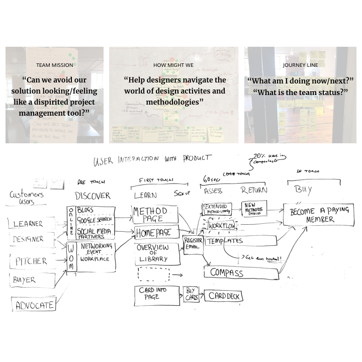
Same problem, different lens: differing mental models between junior, mid-weight and senior designers.
Competitive analysis
“Don't look at the competition and say you're going to do it better. Look at the competition and say you're going to do it differently.” — Steve Jobs
From the workshops I was able to hone in a set of ‘must-have’ learning criteria that designers currently cannot find online. Through further analysis, several comparable models were identified; our closest competition was Luma Institute.
Armed with research reports, I merged redundancies with opportunities through Feature and SWOT analysis. This criteria was used to update user stories.
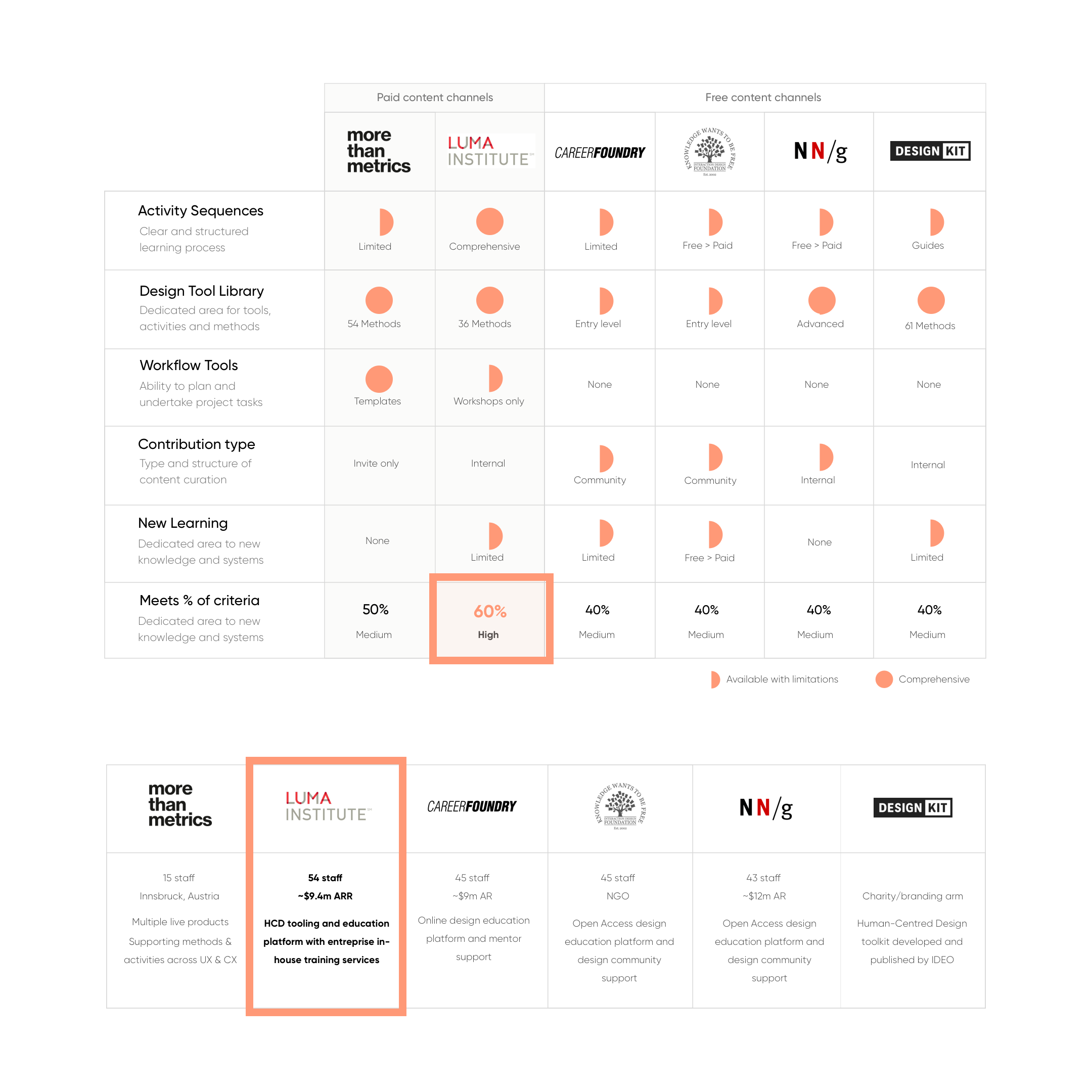
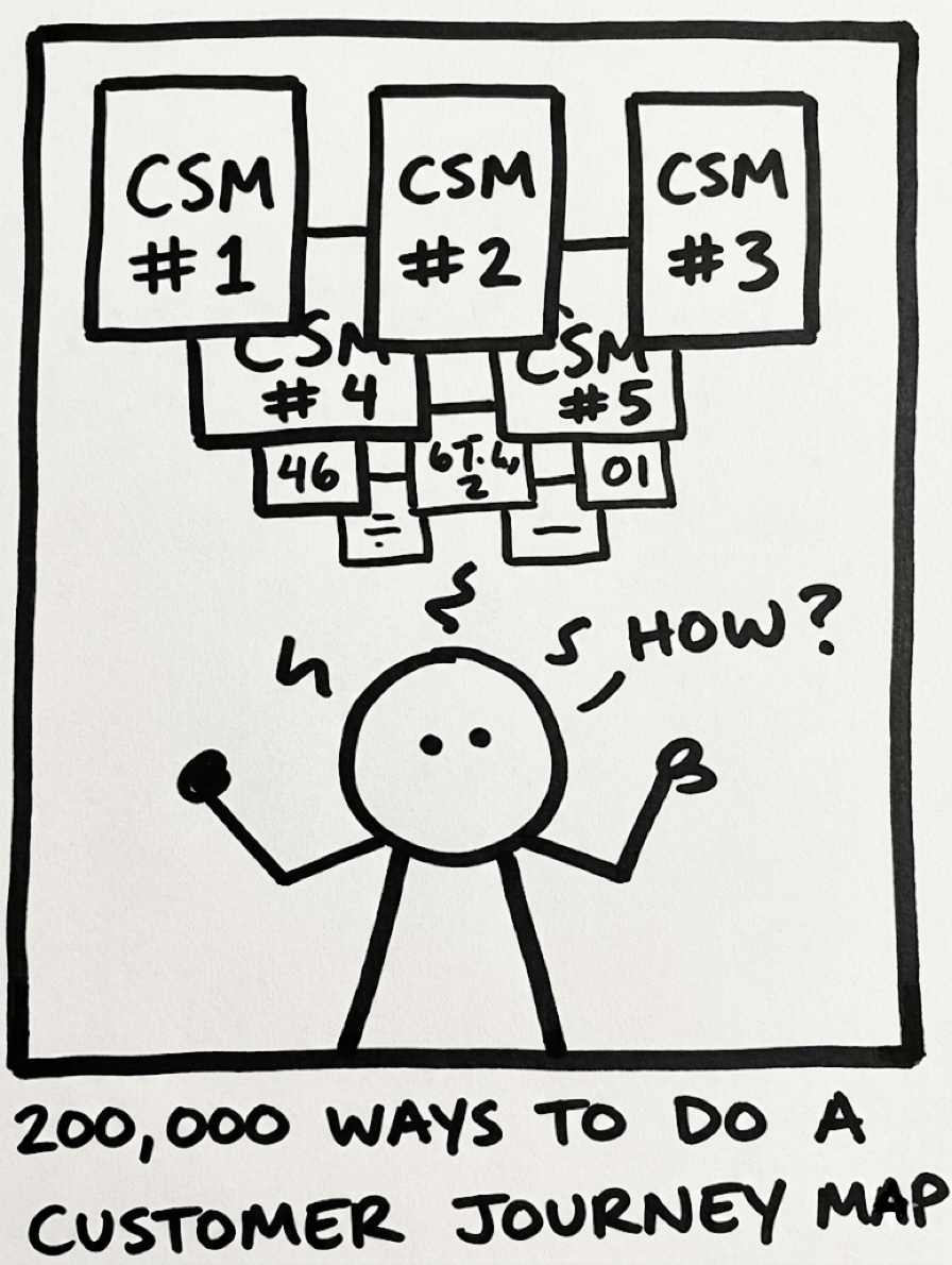
Method libraries exist with limited practical application.
Key takeaways
Several key opportunities exist that are absent from the current competitive portfolio. No competitor was satisfying the full set of criteria designers said they needed, a clear opening for differentiation.
Weaknesses centred on method diversity and applicability. Existing tools lacked depth where practitioners needed it most, specific, actionable, contextually appropriate methods.
Strengths revealed overlooked use cases within the current competitive flow. Mapping competitor journeys exposed gaps that informed both the IA and the prioritised feature backlog.
Comparative user-testing: journey mapping
I ran moderated usability tests on competitors' websites with 8 designers. We covered both exploratory (scenarios) and task-specific tests, collecting quantifiable data from SEQ, plus completion rate, time-on-task, and error rates. This gave the clear insights and journey map needed across key pages.
A survey was assembled to assist with prioritising user stories. These were validated with participants, and armed with prioritised stories, I began defining the high-level backlog, an early signal to engineering of what was coming.
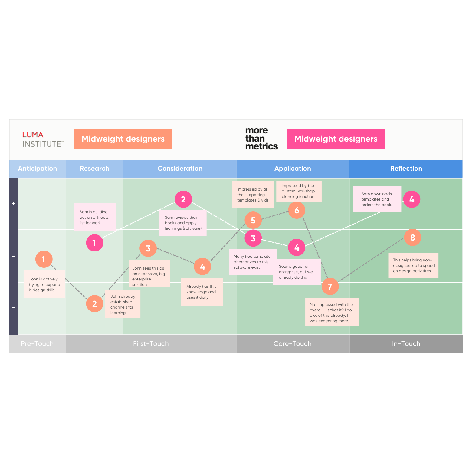
High-level exploratory journey line of a competitor's website.
Prioritisation: Impact / Effort
Armed with user problems sourced from research and validated against survey and competitive data, I looped in engineering, BA, and QA to discuss and scope high-level requirements, communicated timelines, and provided backlog estimates.
I undertook feature prioritisation using MoSCoW, progressing to an Impact/Effort matrix once engineering estimates were in hand, getting into the detail of each feature, key tasks, and providing estimates within engineering time constraints.
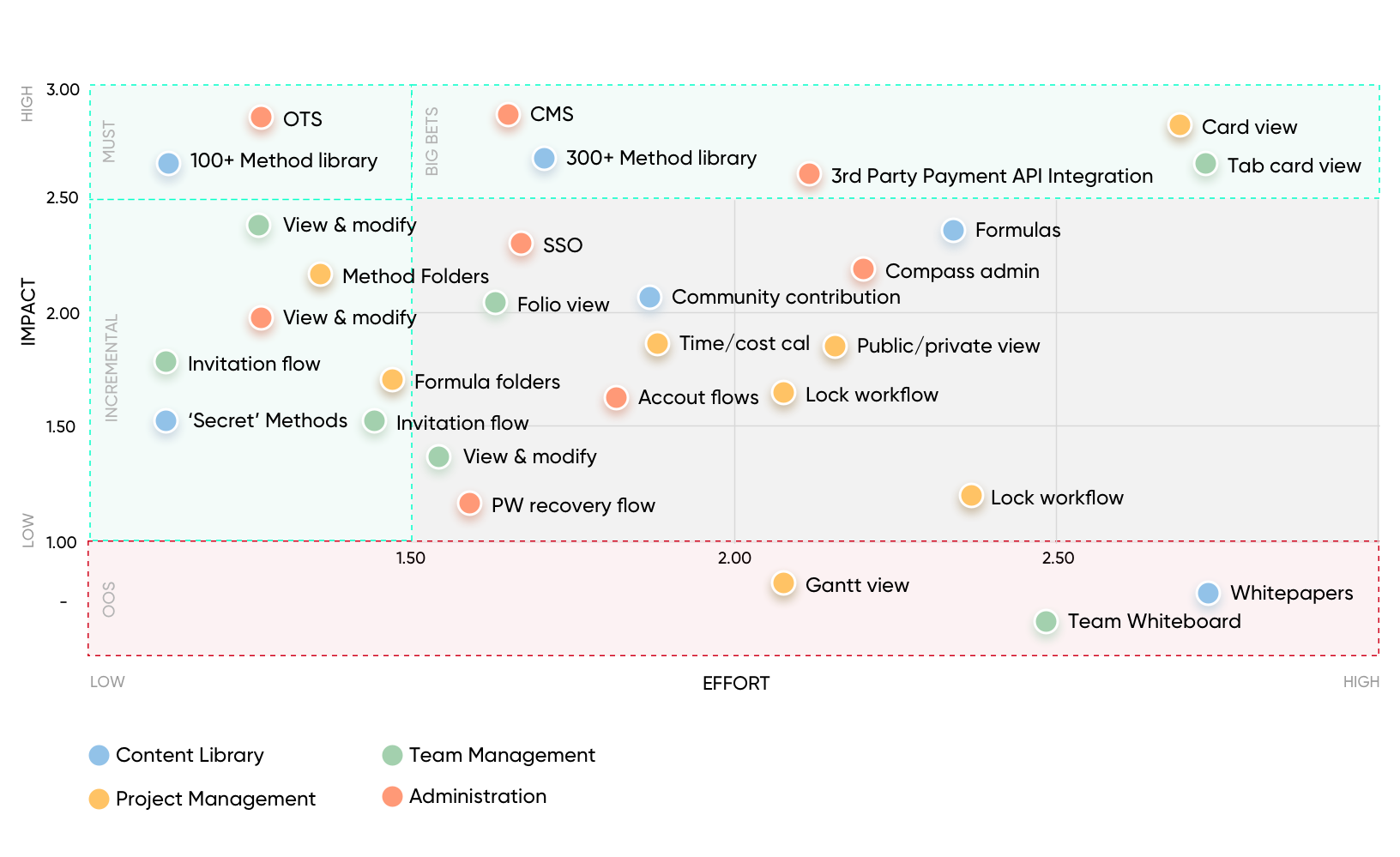
High-level view. A confidence overlay score from granular task estimations was added against each item.
Key takeaways
Prioritised feature list against research data for our MVP (exact match). Every MVP item was directly traceable to a validated user problem, no guesswork, no stakeholder pet features.
Horizon 1 build: high fuzzy match requiring user/business validation. Features with strong directional signal but not yet proven, scoped for early post-MVP testing cycles.
Horizon 2 build: low fuzzy match requiring considerable research. Future-state concepts noted but deliberately excluded from scope to protect delivery momentum.
User flows & wireflows
With primary and secondary use cases identified, I merged 22 scenarios into 5 primary user flows:
Product purchasers: Those who had purchased off-site products.
Off-page referral traffic: Search engines and external links.
Account upgrade flows: Free to premium users.
Login / registration / password recovery: Fundamental flows.
In-product experience: Notification triggers.
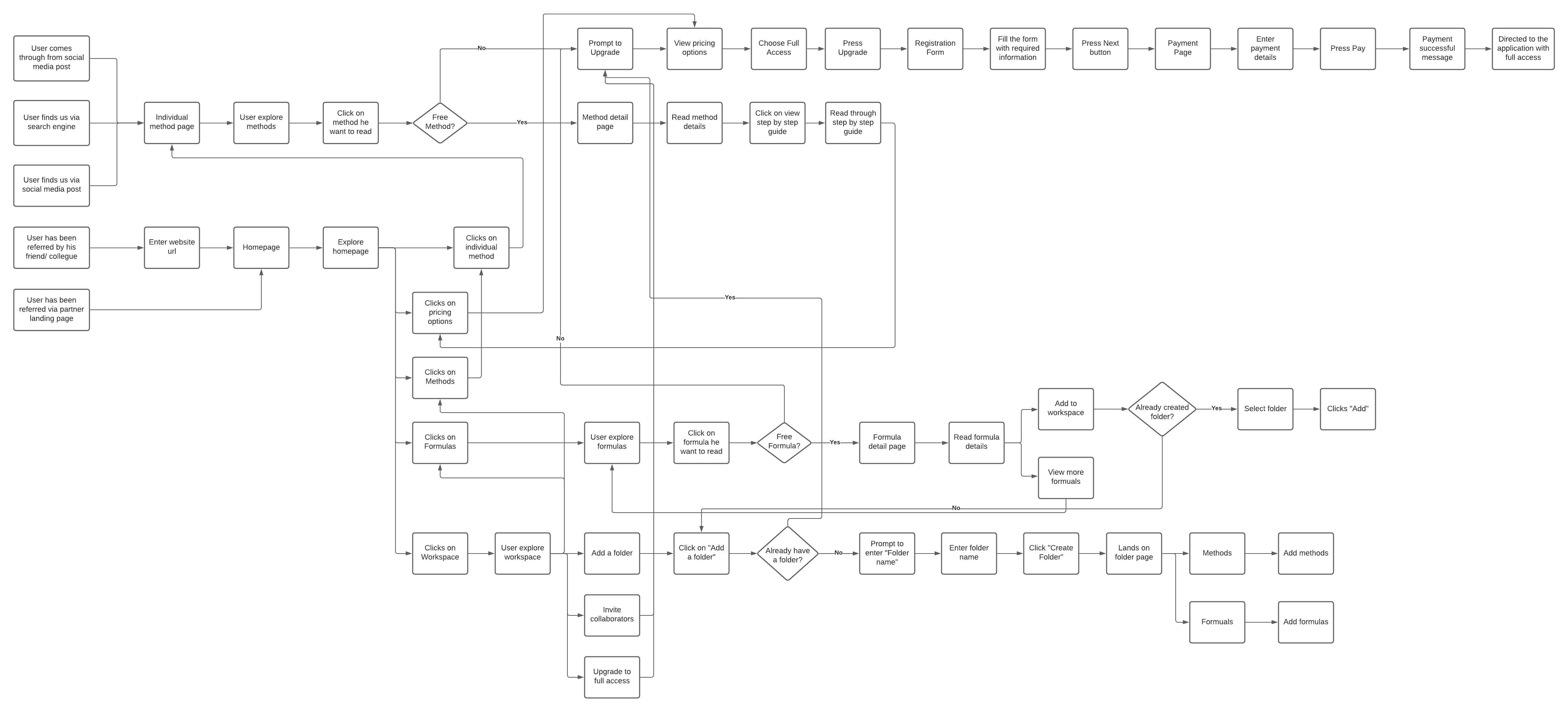
Scenario: Paid user accessing content library.
Concepts & mobile prototypes
Based on the prioritised list, validated with the team and cross-checked against our research, I set up a repository for interface ideas for the team to expand upon key scenarios and create concepts, or sort existing examples into each user flow folder.
Process & tracking
Lo-fi responsive concepts. Balsamiq for mobile, tablet and desktop, tested with junior and senior designers.
Iterative testing cadence. Per 3 tests, concept updates were made around key themes, tracked in our usability report repository.
Managing creative scope. UI ideas had to be capped; the design team were producing abstract and unusable concepts. A structured vote-and-move-forward process was introduced.
Lo-fi responsive concepts tested with junior and senior designers, iterated per 3 sessions.
Usability testing
Multiple rounds of user testing (concept stage) and usability testing (mid-to-hi fidelity). Numerous errors surfaced early, confusion around what the product was regardless of entry point, requiring an overhaul of copy and the onboarding flow.
As the quantifiability structure of testing increased, I modified flows, features, and content to improve key error rates, introducing SEQ intercept surveys into both task and exploratory scenarios to give more dimension to the Think Aloud and observational test structure.
SEQ results: Cohort 1, Week 2
Difficulty rating per feature (1 = very easy, 7 = very difficult)
18
user tests
6
avg SEQ
4
iterations
88%
SUS score
Key takeaway: The aggregated output of the SEQs was a strong indicator of which flows to prioritise and directly informed flow modification decisions across every iteration.
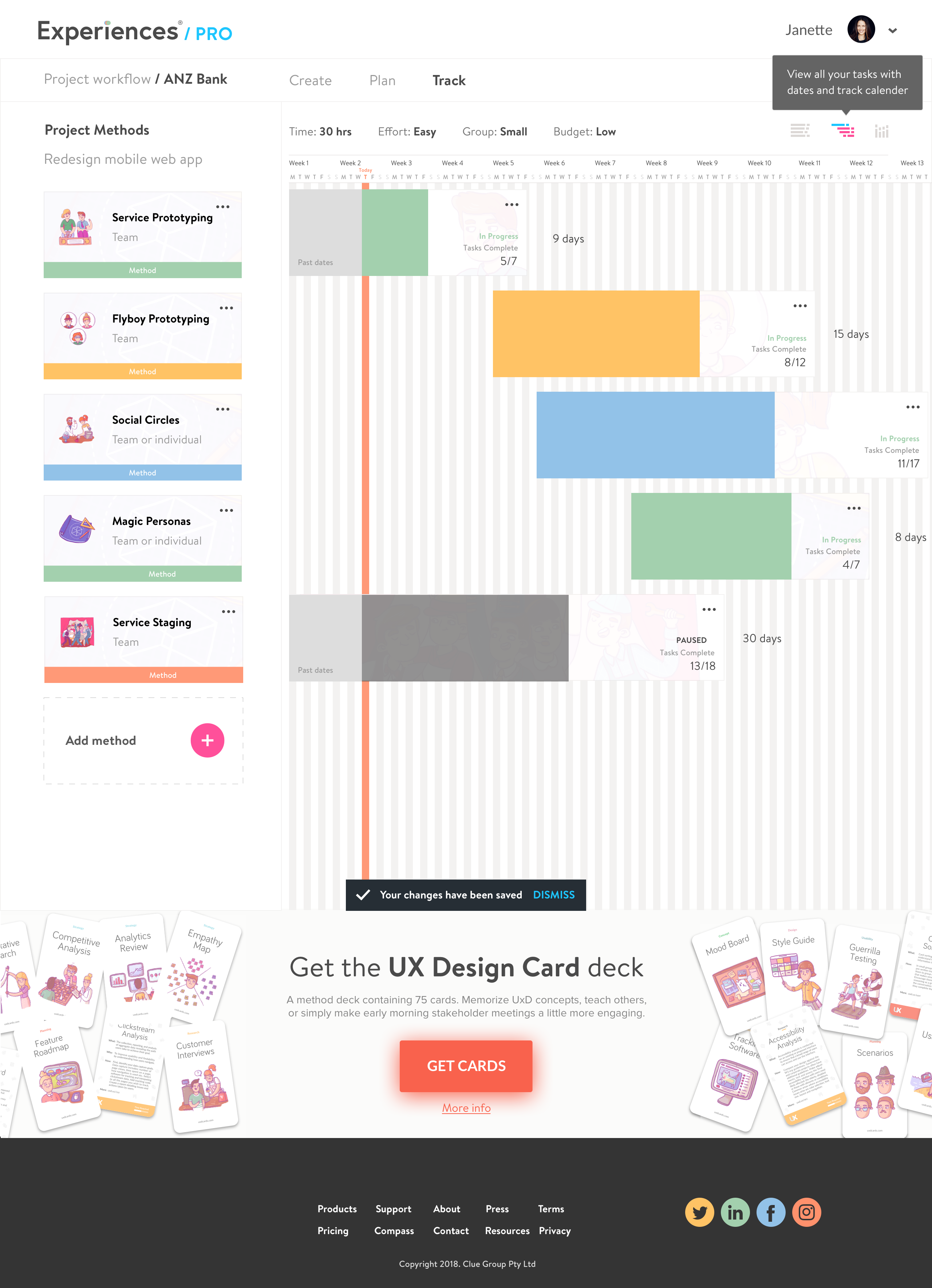
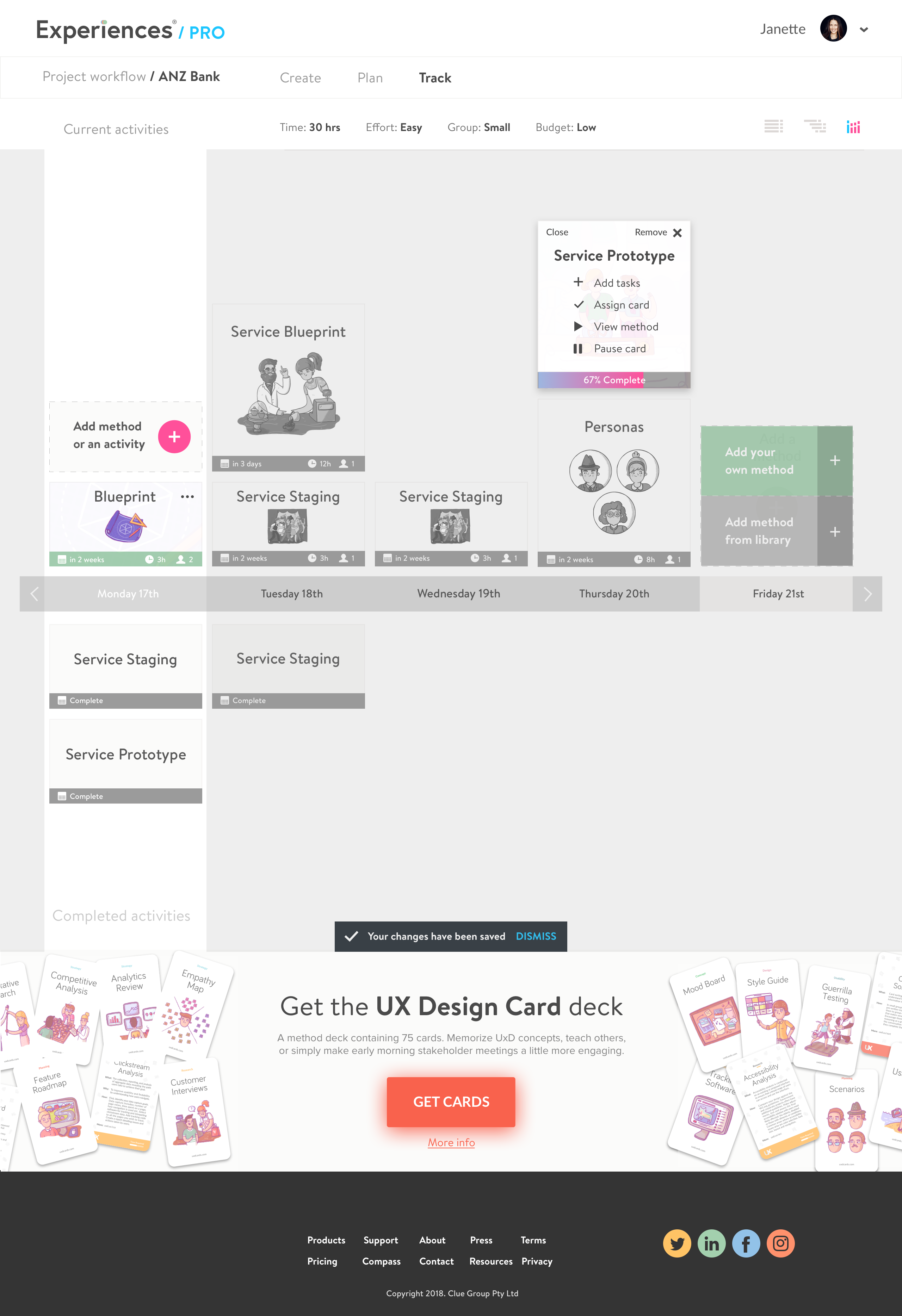
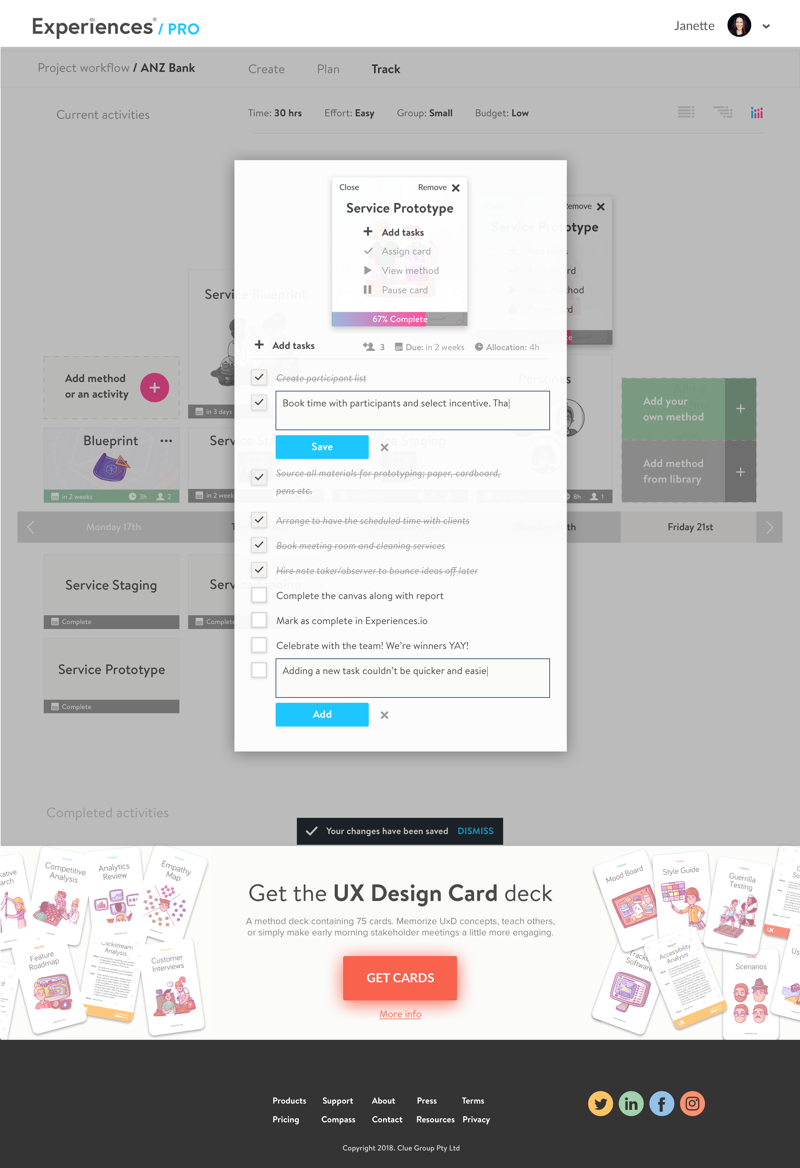
UI Design
With research, concepts and prototypes validated, and key features and primary user flows prioritised, I began UI design starting mobile-first.
Mood board. Contributed to by every team member, building shared visual alignment before a single UI screen was drawn.
Tooling. Figma as the primary tool, with components from Sketch and Adobe Illustrator. Material Design and iOS guidelines followed throughout.
Component library. Built and maintained across the project, minor creative licence applied given the robust testing of the prototypes.
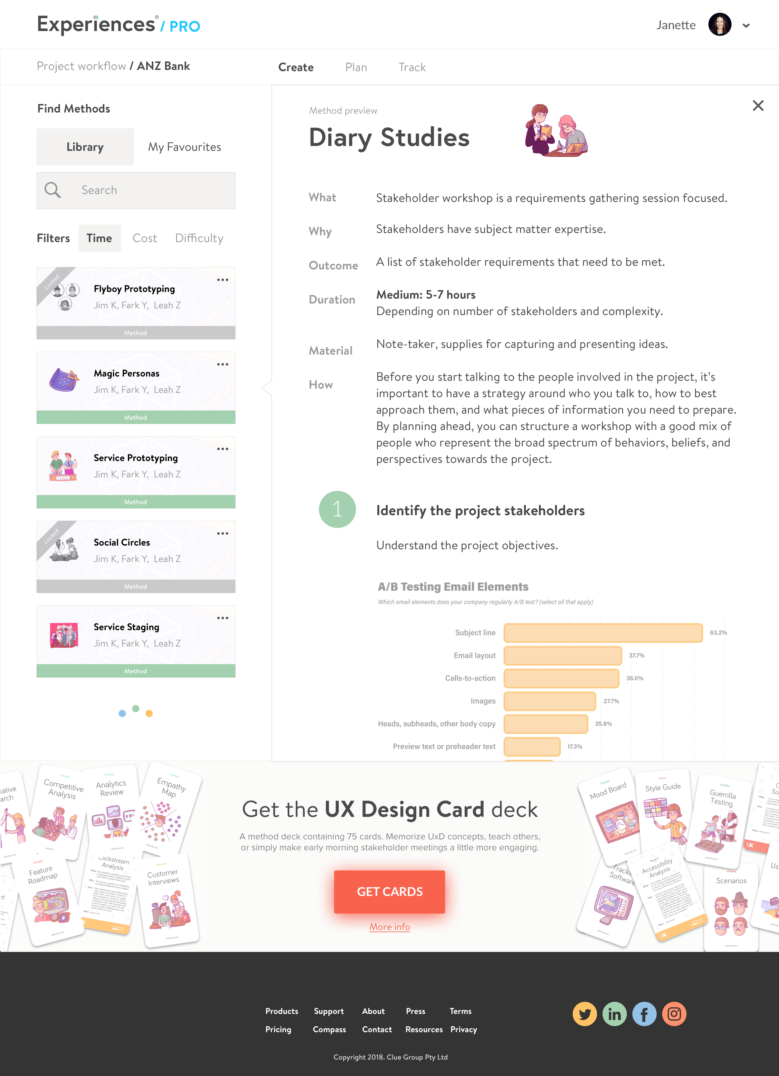
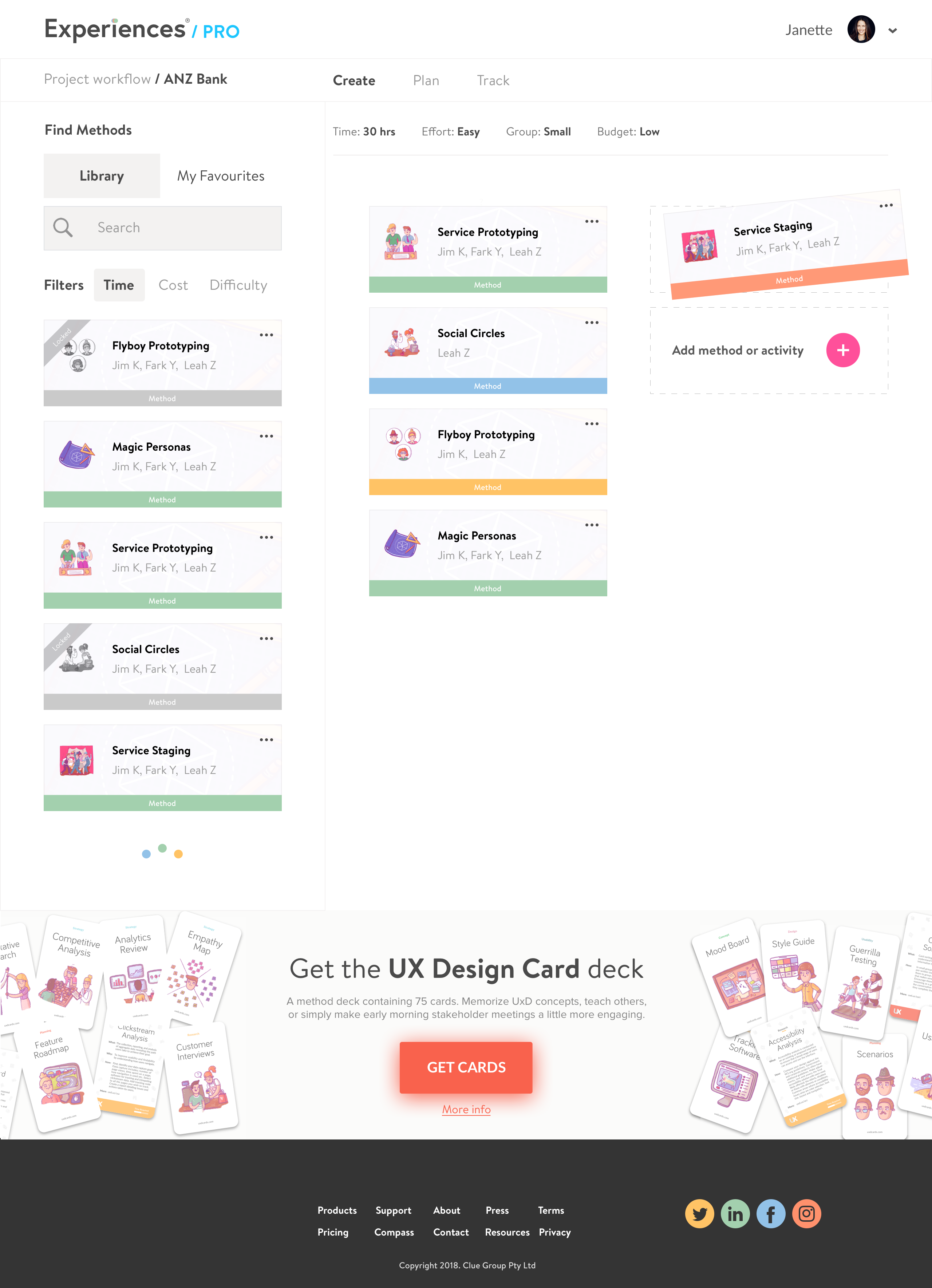
Desktop: Hi-fi Workspace activity view.
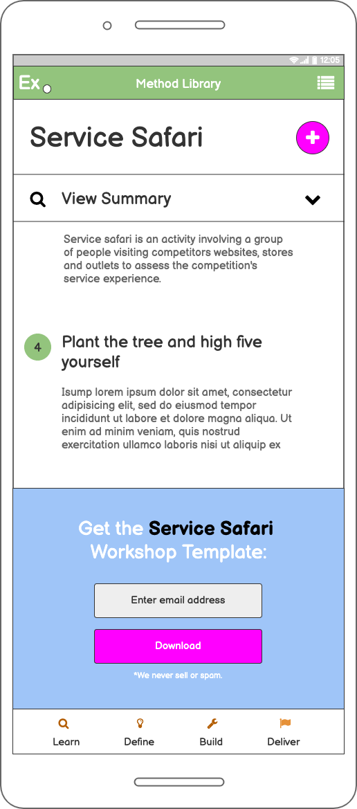
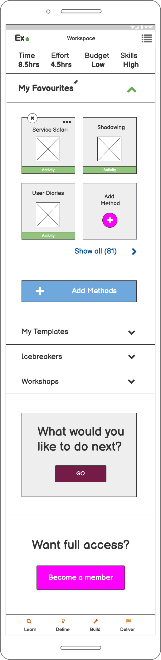
Mobile UI
Challenges & lessons
Research challenges
Comprehension. Junior designers didn’t know what they didn’t know, making it difficult to surface the right insights through standard interview techniques.
Identity. Challenging to find ‘mid-weight’ designers; many self-identified as either junior or senior, broadening alignment scope considerably.
Expertise variance. Tasks and job challenges between juniors and seniors differed significantly, requiring extensive user and usability testing to establish reliable themes.
Remote team. International collaboration via meetings and workshops resulted in task delegation and varied response times, reducing overall team cadence.
Costs. Reduced labour costs via offshoring, but extra expense incurred due to project extension.
What failed: lessons
Outliers. Interviewing design managers, mentors, and teachers was a distraction, too far removed from the ‘beginner’s mind’ to yield insights worth exploring.
Target segmentation. Participants were loosely defined as ‘junior’ or ‘senior’; tighter segmentation based on existing user characteristics would have sharpened the research from the outset.
Participation. Scheduling interviews, user tests, and usability sessions with mid-weight designers simply didn’t work.
Proximity. Senior designers lacked definition and recall around the learning journey, too occupied with strategic pursuits to provide grounded insight.
No analytics data. One of the first things I look for in any project: virtual page views, events, and goal/funnel setup data were absent.
Lacklustre commitment. Post-discovery, several team members weren’t delivering on commitments. Moved to granular task management and accountability coaching to achieve outcomes.
300+ alpha users. On time, on budget. Zero product to validated MVP in ten weeks.
Early adopters from Apple, Google, eBay, IBM, Amazon, and Lloyds Bank validated the product within weeks of launch, without a single paid acquisition channel.
Every deliverable was co-created with engineers and signed off against validated research. The outcome: a fully responsive product with a 250+ method library, shipped clean.
Delivery outcomes
240+
screens shipped across mobile, tablet and desktop
100%
on budget, 30+ iterations, validated with real users

This is how I work with product teams. Structured research, fast iterations, shipped. Without the agency overhead.
The most switched on design leader I have ever had the pleasure to work with. Across the many initiatives we worked through, he adapted to any and all scenarios and in a true dedicated fashion consistently went the extra mile whenever myself or anyone else in the team needed his expertise. Despite constantly changing leadership, Anton kept his professional hat on whilst maintaining his charming wit and humour to ensure everyone was always included, and lifted the spirits of all team members in stressful situations.
Jake Bayer
CTO, Brancher
Building a SaaS product?
Get a deep-dive experience audit to identify where your product is losing users.